
Love and Hate design
Love


Hate


We had to lay out our examples after writing an L or a D on the reverse to signify whether we liked the design or whether we hated it. After doing this we were then asked to rotate groups so we had other pieces of design in front of us. As a group we then had to spilt the design into two groups of what we thought was like and dislike. After doing this we were allowed to turn the pieces over to see if we had chosen correctly. We found that we had 2 mistakes in each pile. I think this is down to personal choice as we might not have liked something that someone else did.
As a group we wrote a list of all the things we were looking for in the design to decide which group it belonged to. Our list was :
Creativity
Quality
Layout
Colour
Over Simplicity
Bad Type
Structure
Image
Kitsch
After doing this every group put together their lists to make one for the the entire group.
Our judgements were made on :
Layout
Composition
Colour
Communication
Context
Concept
Function
Legibility
Audience
Quality of skills
Non-visual Content
Execution
Visual Content
Media and Method of production
We had a short presentation about what a critical analysis is and how it helps us to improve our work.
Critic, criticism, critical, criterion and critique
= Greek : to judge, to distinguish, to select.
For critical analysis to exist you need to have assessment.
Assessment gives you criteria which helps you to decide if it is good or bad.
Crits :
Guidance
Praise
Input on ideas
Objective
Inspiration
Confidence
Disagreement
Opinions
Confusion
Good/Bad feedback
D describe (What can you see?)
I interpret (What is it about?)
E evaluate (how good is it?)
T theorise (how could it be improved?)
We had to use the above criteria to analyse one of our four images as well as one from another person. I chose the orthodontist logo.
D and I
It is clear that from the type that this is a logo for an orthodontist, it is also clear from the shape of the mouth and the colour scheme chosen.
We then had to do this for our partners image.
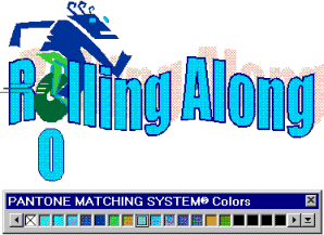
D and I
On first glance this is image seemed to be something quickly put together by a child. When Sarah told me the background behind it I found that it is a logo for a company. My first impression of this was that it was very poorly put together with bad word art and poor colouring. The imagery also seems to be quite dated.
As a pair we had to look for similarities in the ways that we had described and interpreted each image.
Colour scheme
manipulation of fonts
aesthetic
type
tastelessness
size
company
After identifying the similarities we had to evaluate and theorise the two images.
1.
E -
Poorly constructed by someone with no knowledge of design due to the software program used.
Distorted text is inconsistent.
Font is not very attractive and unsuitable for subject matter.
Colour is quite suitable
T -
Re-design.
Change the font, don't make it all central, re-draw imagery, make the name the biggest and all other info smaller and on one line.
2.
E -
Poor communication of method.
Outdated imagery
Poor execution/quality
ugly colour scheme
old fashioned technique
T -
Take clipart/word art out, make it plainer, contemporary, typeface, no effects, include company description.
Whole group
D -
Colour, type selection, manipulation of type, layout, quality of image, line and stroke, texture, composition, theme, content, concept and structure.
I -
Message, clarity, function, context, audience, language and tone of voice.
D+I relationship
D - it's there. The evidence is there. FACT.
I - you have to think about it.
E -
general aesthetic, communication, design elements, quality of execution, does it function, clarity
T -
We all found it easier to theorise the hate image rather than one we loved
'The critique is both a deadline and a marker of perpetual beginning, a freeze frame moment in the context of continuous studio practice. This favours process over product, means over an end'
No comments:
Post a Comment