
Monday, 6 May 2013
OUGD401 : Final Essay
'Advertising doesn't sell things; all advertising does is change the way people think or feel' (Jeremy Bullmore). Evaluate this statement with reference to selected critical theories (past and present).
Advertising is a powerful far reaching tool used to promote commercial products. People across the world encounter some form of advertising everyday and have become oblivious to its power over their emotions and beliefs. Jeremy Bullmore said ‘Advertising doesn’t sell things; all advertising does is change the way we think or feel’, there are a variety of ways in which this statement can be read. Some would argue that advertising should effect the way we think and feel, whereas there are a large majority of people who would argue that advertising is unfair and should not play on peoples emotions.
Bullmore was in full support of the advertising we look for ourselves ‘Advertising that you and I go looking for is neither mysterious nor suspect. It is valued by all and resented by none’ (Bullmore, 1998, Page 5) he believed that because we chose to look for these advertisements that our emotions were protected and that we would not be forced into buying a product against our will. ‘It is the other kind... advertising that goes out looking for people; advertising that seeks to ambush us as we turn the pages of a magazine or the corner of the street.’ (Bullmore, 1998, Page 5) This has become more and more present in day-to-day life and is evident on the popular social networking site, Facebook. The site has started monitoring the pages its users visit the most, the results appear on the right hand side of the page in the form of small advertisements for products which have a subtle link to our interests. In effect, we are essentially doing the advertisers job by involuntarily telling them what interests we have and therefore what advertisements we should see. Bullmore describes it as advertising that ‘desperately needs to draw attention to itself because we’d never, voluntarily, go looking for it.’ (Bullmore, 1998, Page 5-6). The role of the social media in advertising has meant that companies have a direct connection to our online activity and can make links to other products which we do not necessarily wish to see.
A more critical opinion to Bullmore comes from Berger ‘We are now accustomed to being addressed by these images that we scarcely notice their total impact’ (Berger, 1972, page 130) The impact which advertising has can affect the way people feel significantly, primarily because we model ourselves on what the advertising community say is correct. Berger wrote ‘we accept the total system of publicity images as we accept climate’ (Berger, 1972, page 130) this is correct as it seems that society conforms to the common ideology even if they do not agree with it. With this comes the desire to fit into society and cultural groups. The biggest element with this issue is probably fashion advertising which is known for being perhaps the harshest in the industry. Advertisements from the world of fashion illustrate the ‘perfect’ image of a person, this image is widely known and aspired to by many people.The image which is forced on us by the fashion industry can result in self-esteem issues of people who feel they should look a certain way. A way in which advertising covers up their false representations is by manipulating the consumer into believing it is their choice to feel unhappy ‘it proposes to each of us that we transform ourselves, our lives, by buying something more’ (Berger, 1972, page 131).
Gramsci also felt similarly, he came up with the term ‘cultural hegemony’, he said ‘Hegemony in this case means the success of the dominant classes in presenting their definition of reality, their view on the world, in such a way that it is accepted by other classes as ‘common sense’. Gramsci is describing a notion which is still in place in this contemporary society, the dominant classes dictate what the majority should and should not agree with. With this comes the ‘general ‘consensus’..’ and ‘the only sensible way of seeing the world.’ (Gramsci) Similarly to Gramsci and Berger Noam Chomsky’s beliefs about the media and capitalism are in turn very negative. Chomsky debates who takes charge of how the media portray gender and social class. He believed that the masses dictate which social group each person should fall into and how the information which they receive should be filtered and dumbed down, ‘the public must be barred from managing of their own affairs and the means of information must be kept narrowly and rigidly controlled’ (Chomsky, 2002, page 10) Although Gramsci describes the ‘dominant classes’ he also explains that there is not simply one dominant class but the a merging of a number of social classes. ‘There is not in any sense a single dominant class, but rather, a shifting and unstable alliance of different social classes’. (Gramsci) In this Gramsci and Chomsky address the issue of power and who is given the authority to decide what people should be interested in. This, again, raises the point of social class and how it seems the upper classes dominate and ‘rule’ the lower classes.
Gramsci believed that ‘there are on the one hand the dominant classes who seek to contain and incorporate all thought and behaviour within the terms and limits they set in accordance with their interests. On the other hand there are the dominated or subordinate classes who attempt to maintain and to further the validity and effectiveness of their own definitions of reality.’ (Gramsci) Gramsci implies that even though the lower classes do not agree with being ruled by the upper classes they conform anyway. Similar to this Chomsky wrote ‘There is first of all the class of citizens who have to take some active role in running general affairs. That’s the specialized class. They are the people who analyze, execute, make decisions, and run things...’ (Chomsky, 2002, Page 16) The suggestions running through this statement imply that the dominant classes believe that the majority do not have the intelligence to decide for themselves, ‘their function in democracy.. is to be ‘spectators’, not participants... The compelling moral principle is that the mass of the public are just too stupid to be able to understand things’ (Lippmann in Chomsky, 2002, Page 17). The implications of Lippmann’s theory are present in day-to-day life and massively in news publications, as there are certain newspapers which are meant for a specific ‘audience’ and class and therefore are filtered down so they can be understood by the public.
Lippmann felt strongly on this subject like Chomsky, he labelled the majority ‘the bewildered herd’ (Lippmann in Chomsky, 2002, Page16) he believed that the dominant class lead the majority around and controlled the amount of freedom they could have in their decisions. ‘We have to tame the bewildered herd, not allow the bewildered herd to rage and trample and destroy things.’ (Lippmann in Chomsky, 2002, Page 18) The media would fall into the category which Chomsky describes as ‘the people with real power...the ones who own society’ (Chomsky, 2002, Page 18) it would seem that the people who own society have the influence to change the way people feel by simply using an ideology in an advertisement. This raises the question that if the majority have infact become a ‘bewildered herd’ is there any chance of them regaining their independence and deciding for themselves? Chomsky writes ‘Occasionally they are allowed to lend their weight to one or another member of the specialized class. In other words they’re allowed to say ‘We want you to be our leader’’ (Chomsky, 2002, Page 17) this could imply that the dominant classes making the decisions is now not a problem but is accepted as normality. advertising, like the dominant classes, could be seen as an attempt to tease and manipulate the masses by suggesting that they have made the decision to buy a product when infact they have simply fallen for the false promises set out by the industry.
Advertising falls into the same category as the notion of social democracy. Berger describes the promises advertising makes as ‘the promise not of pleasure, but of happiness’ (Berger, 1972, Page 132) with the introduction of different brands producing the same product, buying has now become a deciding factor of social class. Berger writes that ‘Happiness of being envied is glamour’ (Berger, 1972, Page 132) and that ‘Being envied is a solitary form of reassurance’ (Berger, 1972, Page 133) this implies that the upper class buy into the glorified brands in order to be envied by the lower classes which brings them happiness. ‘The sum of everything is money, to get money is to overcome anxiety. Alternatively the anxiety on which publicity plays is the fear that having nothing you will be nothing’ (Berger, 1972, Page 143) this denotes a previous point that people buy into a commodity culture in order to fit in with society but it is also a major feature in the advertising industry. As advertising plays on the consumers emotions it can cause people to worry about not being able to afford the products and brands which enable them to be a part of the group they aspire to be in.
A common tool within advertising is to attach itself to a popular event or person which people admire and love, this was present in the late 1800’s with the advert for Uncle Sam’s oven range (see Fig1) The brand purposely made reference to Independence day in order to play on the pride and emotions of the American people. In doing this the audience would first recognise the event and therefore make an unconscious mental link to the product. ‘This more, it proposes, will make us in some way richer-even though we will be poorer by having spent our money’ (Berger, 1972, page 131) The consumer believes that by buying the product they are buying into the pride an honor which comes with the independence of America, when in retrospect they are buying a very deviously advertised branded oven.
Not only does social class depend highly on advertising but also gender. The advertising community use representations of gender to isolate people. Representations of gender in the advertising industry raises some controversial questions. Laura Mulvay wrote ‘Women are simultaneously looked at and displayed, with their appearance coded for strong visual and erotic impact’ (Mulvay, 2009, Page 19) Women everyday are objectified by the media, they are either represented as a housewife or staged to look attractive. ‘The determining male gaze projects its fantasy onto the female figure, which is styled accordingly’ (Mulvay, 2009, Page 19) Mulvay addresses the ‘male gaze’ many times during her writings, she believes that women are objectified and negatively represented. However, though most women would see this as a negative representation there are a small group of women who would not be offended by this stereotype. One could argue that men are represented stereotypically, though it could be perceived as more positive, and they are also objectified like women. It could be said that stereotypes in general can be seen in both positive and negative ways depending on who is viewing it.
In many advertisements women are staged in a certain way to grab the attention of either a woman who aspires to be something different or a male who finds her attractive. Women are commonly used in male advertising to gain the attention of the audience by first attracting them to the female. ‘As Budd Boetticher has put it... She is the one, or rather the love or fear she inspires in the hero, or else the concern he feels for her, who makes him act the way he does. In herself the woman has not the slightest importance’ (Boetticher in Mulvay, 2009, Page 20) this implies that the use of a woman in male advertising is simply a way of attracting the attention of a male and creating some form of emotional connection between them. Mulvay describes this through the media of film, she believes that men project an image of themselves onto a character and therefore feel some form of emotion towards the woman. ‘The man controls the film fantasy and also emerges as the representative of power in a further sense: as the bearer of the look of the spectator, transferring it behind the screen to neutralise the extra diegetic tendencies represented by woman as spectacle.’ (Mulvay, 2009, Page 20) The implications of this statement are that men need the presence of a woman in order to go along with the narrative structure of a film.
There have been many debates about the treatment of women in advertising but little has been done to abolish the stereotype. As advertising must rely on stereotypes in order to grab their audiences attention stereotypical representations of gender are used in a wide number of campaigns. It has become very easy to simply rely on a stereotype to attract an audience. Two of the few companies which have not conformed to this ideology are Dove and Boots. In their more recent campaigns the companies main aim has been to attract real women by representing them in the correct light.
The Dove campaigns are famous for showing the real image of a woman rather than a young, size zero model. In one of their campaigns they feature six women who range from tall to short, slender to curvaceous and old to young, along with this they also include women from different ethnic backgrounds rather than a ‘typical’ white British woman (See Fig. 2). In the ad the women are all styled in different types of lingerie, some have chosen to cover their stomachs whereas others have them on display. This connotes that each woman possesses a different style and also suggests that women can wear lingerie no matter what their size, shape or age. The photograph used is taken against a plain white background which enables the attention of the audience to be solely on the women. This would be seen by many women as a positive representation as they are able to relate to the women being shown.
An advertisement showcasing a negative representation of a woman would be a Calvin Klein campaign featuring the popular movie actress, Eva Mendes (See Fig. 3). Her costume in the image is very suggestive as she is wearing small lingerie, stockings, suspenders and high heeled shoes. Her stance is also extremely sexualised as she is stood upright with legs parted and her hands on her hips. The connotations of this stance are primarily sexual with a secondary hint of empowerment. This advert could be viewed in a variety of ways with both males and females seeing it positively and negatively. A positive view would be that she is utilising her sexual presence in order to be noticed, some women might think that this is a way of the woman taking the negative stereotype and turning it around so that she has the power to control it.
Berger wrote ‘the social presence of a woman is different in kind from a that of a man. A man’s presence is dependent upon the promise of power which he embodies... A man’s presence suggests what he is capable of doing to you or for you... a woman’s presence expresses her own attitude to herself, and defines what can and cannot be done to her’ (Berger, 1972, Page 46) With these two factors working hand-in-hand the advertising industry cleverly plays on the male and female stereotype and how they work off each other. An example of this can be seen opposite the image of Mendes in the form of an image of the male model, Jamie Dornan, wearing nothing but boxer shorts. His body has been, like Mendes’, altered and his stance staged to look more attractive but there are substantial differences between the two people. Berger wrote ‘Men survey women before treating them. Consequently how a woman appears to a man can determine how she will be treated’ (Berger, 1972, Page 46) this implies that if a woman chooses to buy into an ideology set in an advertisement then she wants to treated in the same way. This raises the question of how different genders would treat the woman shown.
With the beliefs of Berger, Chomsky, Mulvay and Gramsci considered one would conclude that the media use advertising to promote a cultural society which has been tailored for the minority to rule over and use in which way they please. With reference to the statement ‘Advertising doesn’t sell things; all advertising does is change the way we think or feel’ it would seen that Bullmore feels both positive and negative about advertising and how it affects different people. The implications of Bullmore’s view would be that the type advertising that changes the way we think and feel is a very negative form of communication and also seems to be the kind we do not voluntarily wish to see. Chomsky wrote ‘most people are guided by just emotion and impulse’ (Chomsky, 2009, Page 20) one would think that the strategies used in advertising play on this attribute and therefore achieve their purpose by manipulating the receivers.
Word Count - 3188 inc. Quotes
Fig 1.
Uncle Sam’s oven range (1876) [online image] Available from: <http://kc-hardingham1013-cts.blogspot.co.uk/2010/11/critical-studies-image-analysis.html> [Assessed 7 Nov 2010]
Fig 2.
Dove, (2005) [online image] Available from : <http://dipitblack.com/2012/10/11/celebrate-your-curves/doves-popular-ad-campaign-that-used-real> [Assessed 11 Oct 2012].
Fig 3.
Calvin Klein Underwear (2009) [online image] Available from: <http://www.fashionwindows.net/2009/06/calvin-klein-fall-2009-global-ad-campaign/calvin-klein-underwear-fall-2009-ad-campaign-2/> [Assessed 18 June 2009].
Bibliography
Berger, J. (1972) ‘Ways of seeing’ London, British Broadcasting Corporation.
Bullmore, J. (1998) ‘Advertising and it’s audience’ [online] WPP Group. Available from: <http://www.wpp.com/NR/rdonlyres/ED5FD8FF-F951-4C77-8ADA-FB5E61C85587/0/advertising_and_its_audience.pdf>
Chomsky, N. (2002) 2nd edition ‘Media control. The spectacular achievements of propaganda’ New York, Seven Stories Press.
Chomsky, N. (2008) ‘What we say goes’ London, Penguin Books.
Chomsky, N. (2012) ‘How the world works’ London, Penguin Books.
(Gramsci) Goldberg, M.L., (2001) 'Hegemony' [internet], Washington, University of Washington, available from <http://faculty.washington.edu/mlg/courses/definitions/hegemony.html> [accessed 1/1/13]
Mulvey, L. (2009) 2nd edition, ‘Visual and other pleasures’ Hampshire, Palgrave Macmillan.
Fig 1.
Uncle Sam’s oven range (1876) [online image] Available from: <http://kc-hardingham1013-cts.blogspot.co.uk/2010/11/critical-studies-image-analysis.html> [Assessed 7 Nov 2010].
Fig 2.
Dove, (2005) [online image] Available from : <http://dipitblack.com/2012/10/11/celebrate-your-curves/doves-popular-ad-campaign-that-used-real> [Assessed 11 Oct 2012].
Fig 3.
Calvin Klein Underwear (2009) [online image] Available from: <http://www.fashionwindows.net/2009/06/calvin-klein-fall-2009-global-ad-campaign/calvin-klein-underwear-fall-2009-ad-campaign-2/> [Assessed 18 June 2009].


OUGD401 : From Theory to Practice : Final Publication
Final printed publication...


Saddle stick binding.

Middle of book with saddle stitch

Back cover

Pages do not meet up
I am not fully pleased with the publication and the construction as it is not nearly perfect enough. I cannot do anything to change this as I have left it too late.
Sunday, 5 May 2013
OUGD401 : From Theory to Practice : Design Development
I am producing my publication on Alfred Hitchcock. I want to produce a timeline illustrating Hitchcock's life including both the personal and professional aspects.

Thumbnail ideas

I aim to produce my publication as a timeline of Hitchcock's life. I would like to make it as interactive as possible in order for it to stand out among the many other publications about Hitchcock's life.
In order to do this I want to cut into the publication once it is printed and have small slots where other printed material can be stored.
One idea I have had is to create my publication as a timeline of Hitchcock's life. My initial idea does match this idea but not in the literal sense. I have drawn out this idea and found that it could be very interesting. I would produce it as a concertina book which can be folded out to reveal the whole timeline. I think this idea could be very successful but that it would be a very brief overview and would not show the in depth study I am expected to show.

This idea would be mainly image based with small amounts of body copy to not be too over crowded and complicated.
Improved timeline book layout ideas...
Improved timeline book layout ideas...

I like the idea of having a timeline of Hitchcock's career within my book but I feel that I could not display the amount of information I wish with this concept. I propose to produce a concertina timeline which slots into the book and can be pulled out, this would help me to merge the two ideas together and successfully add an interactive aspect to my publication.


Initial Ideas...

I brainstormed the first things that came to mind when I thought about Hitchcock. I wanted to include all of these options within my publication in some way.

Brainstorming ideas for the format of my publication. I like the idea of presenting my publication within a viewing glass or a set of glasses. I think I like this because it is a really interactive way of illustrating Hitchcock's personality and behaviour.

Possible topics to cover in my publication.

My initial idea was to create a publication which details the life of Alfred Hitchcock and then have a simple timeline which pulls out of the back of the book and gives the same information in a different format. The idea behind this is that the audience can look at the timeline and be told which page of the publication they need to look at if they wish for more information.
Peep hole concept.....

Mock ups with peep hole...


After producing rough mock ups of the peep hole concept I think the circular peep hole is the most effective. This is going to be hard to cut out of my paper without a circle cutter. I will be very nervous to do this as I will only have one final outcome to cut into, unless I print it multiple times.
Final design inspiration...
I found this publication based on cinema on behance. I used it as my main inspiration for my final publication as I wanted to merge my two design ideas of a timeline and a booklet. I really like the aesthetic of the design and think the colours work really well alongside the black and white images.


Size of my publication...
I want to produce something which is handy and not too bulky and big. As a student I know how difficult it is to carry around a huge book which does not fit into my bag. I plan on making my booklet fit onto an A4 document and possibly be pocket sized.

This is an image of the size of my publication on an a4 sheet of paper.
Layout...
When thinking about my publication in more detail I think the target audience would appreciate a timeline within a detailed booklet. I am, therefore going to merge my ideas together and hopefully reach a happy medium between the both. The layout of my booklet will be very simple and clear, the date will be situated in one of the four corners with a short description either above or underneath it, this will then be accompanied by an image which goes with the fact. This will form the bulk of my book though I will elaborate more into some aspects of his life which my target audience might want more information about.

Stock..
The stock of my book is a hard thing to decide on. I want to produce it on stock which is thick enough for double sided printing but I don't want it to be too thick to close nicely. I chose 2 off white stocks and one red stock to experiment with. The antique white paper would be the best option for double sided printing as it is thick and would not show through the reverse side but I think printing the thickness of my publication would make it very difficult to close. Bulky newsprint is my preferred paper as I think it feels really expensive and the print quality is very good. The issue I have with this stock is that it is not just thick enough for double sided printing. I do however wish to use it as I think it is best suited for my publication. Red stock is a bit of a gamble for me as I think it would work for some aspects but not for the whole publication. I tried this out for my presentation with the Hitchcock's blondes but it did not work the way I had hoped.
In the end I have chosen to go with the bulky newsprint as it suits a publication best.

Antique White, Pearl Grey, Red, Bulky Newsprint
Fonts...
After some deliberation and trail and error experiments with font I have decided on the three which I will use throughout my book.

Bebas : Headings and titles
Helvetica - body copy
Basic title font - quotes and subheadings
Colour...
I will have to include multiple colours throughout my publication as the movie posters are all in colour. Besides this I plan on using only two colours. Black and magenta. I have chosen these colours because the images of Hitchcock are primarily in black and white which I personally prefer. I want to include a colour within the book and initially thought that red would be best suited. This has been done many times and is a colour which would probably be most associated with Hitchcock due to the connotations of the colour. I wanted to try a colour which was close to red but also completely different. I had used magenta in a previous project and found that it looked really professional when printed.

Marking up every page on illustrator...
Before jumping into the final design I wanted to draw out a few of the pages on Illustrator so I would have a clear idea of how the publication would look.

Front page

Introduction

Childhood

Quote

Timeline

Timeline

Timeline

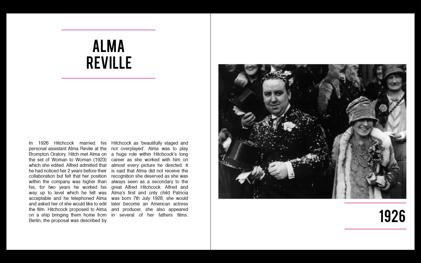
Alma Reville
I am unsure about how many pages I will have as I have some quotes which I am unsure about. From drawing out these examples I can get a clear understanding of the ideas in my head. I am now going to start designing my book.
Designing...
I have started to design my publication at the moment it is going very well. I have kept my design extremely similar to my drawings with barely any alterations. Before designing my book I chose only 7 of Hitchcock's blondes to put inside my book. Now that I have reached the point in the publication where I have to upload these images I am thinking that I need to include all of the actresses which worked with Hitchcock. This means that I will have to use google images as the edited versions would be too small and therefore ineligible. I am quite positive about this change as it allows the audience to see what the women look/looked like within the films, this way they can look out for them when they are watching the film.

I tried to find images which were from the films to make it easier to identify the women.
Final Digital Design..


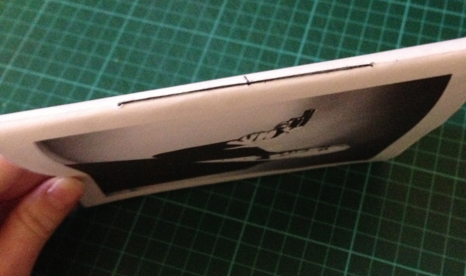
Binding...
I decided that I wanted to saddle stitch my booklet which was something I had never done before. I experimented with it a few times and found it quite easy to do so went ahead and bound my final book. The binding is not the best as the booklet did not print properly on my printer at home, I also did not leave enough room at the edge of my booklet to cut it down to size once bound. I did the best I could with this mistake and my book does not look great but is still functional.


Subscribe to:
Posts (Atom)