Showing posts with label OUGD404. Show all posts

Tuesday, 19 March 2013

OUGD404 - Presentations and Studio Session

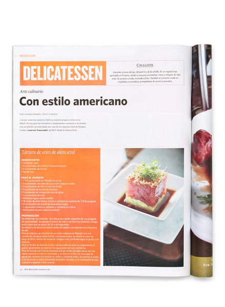
  • What are grids, columns, gutters & margins?
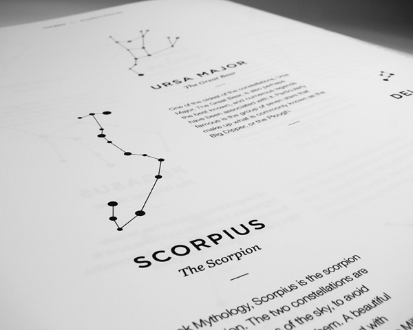
Grid - 2 dimensional structure, serves as a guideline
Columns - vertical, used to align text
Gutter - inside margin or blank space in-between to facing pages. The gutter depends on the binding process. 
Margins - edge or the border 
  • What is DPS and what does it do?
Printed collateral are usually created digitally then printed.
  • What is golden section?
Also known as the golden ratio. Irrational number which means it cannot be whittled down to a simple fraction. 
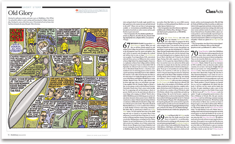
  • Explain why rulers, boxes, folio number, and drop caps are
Rulers - measurements within a document
Boxes - AKA Frames. Text, graphic and unassigned.
Folio numbers - another word for page numbers
Drop Caps - Enlarging the first capital and wrapping the text around it
  • What are 'picas', points and pixels?
Picas are a unit of measurement for typography 
Pixel - square element to make up pictures. Created ideally for web design. Unit of resolution.
Dots - pixels

Last bit of stuff to research :


  • Greeking
  • Folio numbers
  • Ligatures
  • Measures
  • Rulers and boxes

Sunday, 17 March 2013

OUGD404 - DPS

What is DPS and what does it do?

DPS stands for Double Page Spread which is something almost all graphic designers will come across in their career.

The google definition is...


DPS are used in Editorial and publishing design. The function of a double page spread is to convey information over a large area which is folded in the centre. 


Interesting advertising double page spreads..


OUGD404 - Publication/Layout Research

For design principles we have a brief which is to produce a publication about some information we have come up with after a breadth of research. I want to showcase my creative ideas and skills with this brief as I think it is very open and we have a lot to experiment with.


Pentagram are a design studio who I like very much. I found one of their magazine layouts for a college in Vermont. I find this layout very appealing as it is clear and reads very well. I favour a structured layout as opposed to one which is harder for the eye to read and confusing to understand. I think for this brief I could be more adventurous with my layout option as we have been learning about interesting grids and layouts which are in use today.


Publication produced Ani Bushry for a final project. The signature of this piece reflects my personal style, the clean crisp imagery and limited use of colour is very appealing to me. I find the layout very interesting but simple. The grid is very evident and consistent within the whole publication.


Source

I like the layout and overall design of this Universe booklet. I find the minimalism very appealing and the way in which the information has been displayed makes it interesting to read and appealing to the eye. I would like to experiment with this idea within my publication.


Source

Fashion editorial design can take on many different layout and grid variations.