
- Messy
- Likes to go to gigs and festivals
- Baking is her way of coping with stress
1.

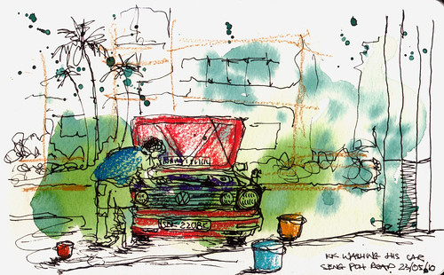
Laura describes herself as messy but she said she lives in organised mess.

As an idea of how to produce my letterforms I think black line illustrations similar to this would work really well.


2.
One of Laura's favourite things to do is to go to gigs and festivals.


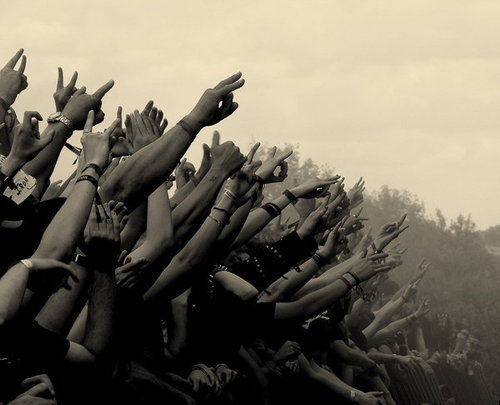
Crowd Source 1
I think an effective way to illustrate festivals and gigs is with the use of a crowd with their hands in the air. This can be easily identified and will look effective.

Crowd source 2

Past to present
Different ways for me to draw the hands at gigs.
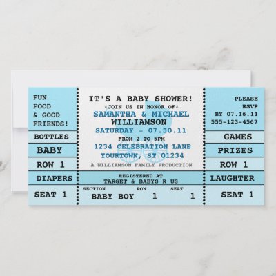

Concert ticket 1

Concert tickets 2

Concert ticket 3

Concert ticket 4
I think I could do something quite cool with concert tickets in my letter forms. I would have to create this design on Photoshop and trace from it.
Laura's favourite song at the moment is by the Mystery Jets.
Mystery Jets Image
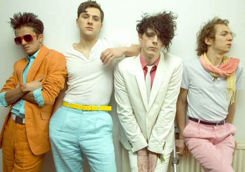
Her favourite bands are Arctic Monkeys and The Maccabees

Arctic Monkeys image

The Maccabees Image
I am going to look at some her favourite band's album artwork as I think it could be a really cool effect to have each of my letter forms with an album cover in the background.

Arctic Monkeys Album Artwork 1

Arctic Monkeys Album Artwork 2

Arctic Monkeys poster

Maccabees Artwork 1

Maccabees Artwork 2

3. Baking


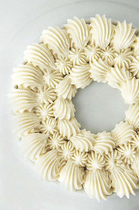
Another way to convey baking would be to represent icing or frosting


Alexandra is a past LCA student who's work I really like. One of my favourites is this Cake and Co. logo. I love the way she has created the frosting on top of the cupcake. This technique could work really well when I am designing my letter forms as it is a simple way to convey the idea of frosting without making it too complicated.

I don't particularly like this typeface as I find it hard to read.

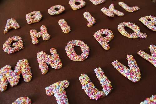
Cake font
I have specific restrictions to my typeface limiting my creative ideas. For instance all of my designs must be in black ink. This is one of my reasonings for choosing 3 specific characteristics from my partner, I think I would find certain aspects of her personality hard to produce without the use of colour.
Saying this I have chosen to Baking which could be considered a hard word to convey without the use of colour, I will research this in order to make sure that can produce these letterforms and people will be still be able to identify what I am trying to convey.


Cookie Type
As I am limited with the range of design I can produce I think I will keep my designs quite simple whilst also including a lot of detail like this type design I found on Pinterest.

Type Source 1
I really like this design because of the dual aspect, it is clear to see which letter form is which as well as them being very detailed. As I like both simplistic and detailed design I think this style would suit my brief very well.
Another way for me to keep my designs simplistic would be to produce small illustrations around the letter form rather than inside it.

G letterform
One of my preferred techniques to to produce letterforms with a build up of images inside it. This is similar to my Summer brief.

Colourful typeface
Though I am limited to black ink I have still chosen colourful typefaces as I think sometimes colourful design can look just as, if not more effective in black and white.

Numbers
For my summer brief I created my alphabet in a similar style to this. I like this a lot though I think it would be best suited to a digital rather than a hand rendered task.

Montage of text
Simplistic design is one of my preferred styles especially simple type. I chose this image because I like how crisp and professional the type looks though it was hand made.

Draw type
Laura enjoys going to festivals which are usually held in fields or in the woodland. When I saw this typeface my initial thought was of a festival though to portray British festivals I would need to add a few tents and beer cans.

Hand Drawn Type 2
The reason I chose this example is because I like the chunkiness of each letterform and how simple but detailed they are. This kind of style could work well with the messy aspect of Laura's personality.

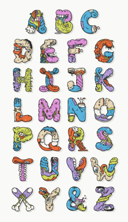
Typeface 1
As I am limited to one colour this example will not work particularly well for my brief though I do like the idea of the build up of different images and illustrations to make each letter form.

Just make it happen
I chose this design as I liked the 3D aspect of it, one of my weaker areas is drawing so I find it quite hard to make my drawings look 3D. I chose this design because I think they have made the letters look 3D with the use of pattern and shapes.
Though I have chosen 3 characteristics from Laura's answers I will also take in to consideration her favourite designer(s) Sagmeister.

Sagmeister 1

Sagameister 2

Sagmeister 3

Sagameister 4

Sagmeister 5

Sagmeister 6
One of the reasons I like to work with other people is the links to other designers and illustrators to add to my references. Sagmeister have produced weird and wonderful work some of which I like but others are not to my personal liking. I have chosen some of their pieces that I found interesting and will experiment with them during my developing stages.
Laura has an identical twin which I think could be a cool thing to include in my letterforms. She also loves Dr Seuss so I had the idea of including Thing 1 and Thing 2 into my designs to represent her and her identical twin.

Thing 1 and 2
Another Idea could be to include different patterns which Dr Seuss illustrations have.
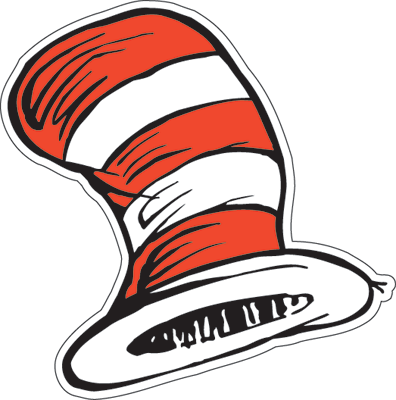
Cat in the hat

Dr Seuss 1

Dr Seuss 2

Dr Seuss 3
After the Power crit


My idea is to have alternate styles for every other letterform. I have worked this out and found that it could work for Laura's name tag though she would not have the same pattern as the typeface. I don't think this will be a problem as it could look like quite a quirky pattern. I will have to research different concert and gig tickets in order to have a wide range of sizes and shapes. Above I have created the generic ticket shape which I did very quickly on photoshop.
As I am limited with the range of design I can produce I think I will keep my designs quite simple whilst also including a lot of detail like this type design I found on Pinterest.

Type Source 1
I really like this design because of the dual aspect, it is clear to see which letter form is which as well as them being very detailed. As I like both simplistic and detailed design I think this style would suit my brief very well.
Another way for me to keep my designs simplistic would be to produce small illustrations around the letter form rather than inside it.
G letterform
One of my preferred techniques to to produce letterforms with a build up of images inside it. This is similar to my Summer brief.
Colourful typeface
Though I am limited to black ink I have still chosen colourful typefaces as I think sometimes colourful design can look just as, if not more effective in black and white.
Numbers
For my summer brief I created my alphabet in a similar style to this. I like this a lot though I think it would be best suited to a digital rather than a hand rendered task.
Montage of text
Simplistic design is one of my preferred styles especially simple type. I chose this image because I like how crisp and professional the type looks though it was hand made.
Draw type
Laura enjoys going to festivals which are usually held in fields or in the woodland. When I saw this typeface my initial thought was of a festival though to portray British festivals I would need to add a few tents and beer cans.
Hand Drawn Type 2
The reason I chose this example is because I like the chunkiness of each letterform and how simple but detailed they are. This kind of style could work well with the messy aspect of Laura's personality.
Typeface 1
As I am limited to one colour this example will not work particularly well for my brief though I do like the idea of the build up of different images and illustrations to make each letter form.
Just make it happen
I chose this design as I liked the 3D aspect of it, one of my weaker areas is drawing so I find it quite hard to make my drawings look 3D. I chose this design because I think they have made the letters look 3D with the use of pattern and shapes.
Though I have chosen 3 characteristics from Laura's answers I will also take in to consideration her favourite designer(s) Sagmeister.
Sagmeister 1
Sagameister 2
Sagmeister 3
Sagameister 4
Sagmeister 5
Sagmeister 6
One of the reasons I like to work with other people is the links to other designers and illustrators to add to my references. Sagmeister have produced weird and wonderful work some of which I like but others are not to my personal liking. I have chosen some of their pieces that I found interesting and will experiment with them during my developing stages.
Laura has an identical twin which I think could be a cool thing to include in my letterforms. She also loves Dr Seuss so I had the idea of including Thing 1 and Thing 2 into my designs to represent her and her identical twin.
Thing 1 and 2
Another Idea could be to include different patterns which Dr Seuss illustrations have.
Cat in the hat
Dr Seuss 1
Dr Seuss 2
Dr Seuss 3
After the Power crit
After my progress crit I settled on the idea of using gig tickets to form the basis of my typeface. I have to idea to add the ticket into some letterforms whilst also taking the letter form out of others. In the crit Amber and Simon mentioned negative space to quite a few of the people in my group, I liked the sound of this idea and thought it could work really well with my typeface.


My idea is to have alternate styles for every other letterform. I have worked this out and found that it could work for Laura's name tag though she would not have the same pattern as the typeface. I don't think this will be a problem as it could look like quite a quirky pattern. I will have to research different concert and gig tickets in order to have a wide range of sizes and shapes. Above I have created the generic ticket shape which I did very quickly on photoshop.
No comments:
Post a Comment