For this task we had to identify 5 pieces of Modernist design and 5 pieces of Post-Modernist design and write a short evaluation of each.
Modernist Design
'From the beginning, Modernism had the urgency of utopianism: the make the world better by design. Today we know better. It takes more than design to change things. But the cultural thrust of the Modernist belief is still valid, because we still have too much trash around us, not only material trash, but intellectual trash as well.'
- Long live Modernism, Massimo Vignelli
Herbert Bayer's poster for Kandinsky's 60th birthday (1926) would be considered modernist design as it clearly demonstrates the typical form before function, an ideology set by Louis Sullivan. During the modernist era urbanisation, the industrial revolution and the French revolution meant that art
and design must move forward. With the introduction of technologies fine art was not powerful enough to stand out in the contemporary world. With modernist design came simplicity and clean lines. It became very important for design to say a message in a simple and clear way. This poster is a perfect example of Modernist design as it illustrates the simplicity which designers were striving for.
The Bauhaus was an experiment which began in 1919. It is known for being the birth place of modernism. It supported the radical ideas of designers and helped to produce design which was very different from the art featured in society. It provided an environment where the ideas were applied to architecture, graphic design and industrial design.
Modernist Graphic Designers favoured symmetry and simplistic imagery which would be recognised all over the country. During the era Russian propaganda took on a very modernist style which has provided us with great references to modernity. This poster uses the colours which were associated with the Russian revolution (red, white and black.) Modernist Graphic Design would still be legible and would probably merge in with the contemporary world of art and design.
With the Russian revolution came this piece of design which signifies the Russian's storming the 'castle' and taking over the ruling of their country. Geometric shapes were also another popular trait set by modernist designers. The use of the red triangle is this piece adds to the drama and effect of this event. This is possibly the most famous piece of modernist design as it is not only conveying a message and belief but is also aesthetically pleasing.

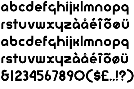
Herbert Bayer's typeface (1925-1997) supports the form before function statement which modernism operates on. This typeface was one designed at the Bauhaus. Herbert believed that typefaces should be simple and clear, he also believed that there was no need for uppercase letters therefore he did not design this typeface with the option to have uppercase letterforms. His typeface is very simple with clean and crisp lines and does not include serifs (no fuss).
Post-Modernist Design
'Post Modernism should be regarded at best as a critical evaluation of the issue of Modernism. In that perspective, it has been extremely helpful to correct, expand, improve the issues of Modernism.'
- Long live Modernism, Massimo Vignelli
David Carson became one of the most famous Post-Modern Graphic Designers when he introduced his magazine, Ray Gun, in the nineties. This magazine focused on experimental typography and ways that it could be set out or presented. David liked to experiment with design in very different ways, his ideas were seen as radical and outlandish but was embraced by the contemporary world. He was famous for his quirky designs and layouts in his magazine, working with type and image also seemed to be one of his passions. In this spread from his magazine the type and image are merged together in a way which would make the audience look at it more intently rather than it just convey the message straight away. This belief is the opposite of Modernism.
Neville Brody is also another famous Post-Modern graphic designer. His work is very similar to that of David Carson although this piece has a more hand-renderred effect to it. Like David, Neville was an art director of a magazine called Face (1981-1986). His work at this magazine is said to have inspired other designers and other magazine publishers. Post-Modernist design puts aside the simple and clear aesthetic and takes on a quirky style with the use of lots of colours and overcomplicated typefaces.
Post-Modernism came around during the 1980's many designers thought that it was just a merging of styles with no rules or characteristics therefore they did not take it seriously. It is from this that we have achieved some of the most famous Graphic Design in the world today. The merging of styles is something which is seen in this 'Lets Dance' piece. The use of different typefaces and colours makes this magazine cover very garish and bold. Post-Modern Graphic Design is know to use multiple styles and often borrows or quotes from a number of historical styles. This piece is a prime example of this as it has used the pop art style along with illustration and photography.
David Carson featured so much in the Post-Modernist era that when searching for Post-Modern design he has multiple pieces of work in the first few images. In this feature in Ray Gun magazine he replaced the article with rows of unreadable text. In the back of the magazine was the actual article if anyone wished to read it. This spread reflects the ideology that legibility was not as important as the aesthetic and overall look of the design.


No comments:
Post a Comment