Based on the material, exercises, discussions and concepts introduced during the studio session:
- Identify and explain 5 reasons why critical analysis is an important part of education, learning and devloping your understanding.
5 reasons why critical analysis is an important part of education :
- it helps us to improve our designs to appeal directly to our audience
- it helps us to improve our design skills and knowledge
- it helps us to make judgements about other peoples work and thus have a clearer view of what works and what doesn't
- it helps us with our confidence
- it helps to clear up any confusion we may have had about the brief or target audience.
- Identify and explain why the crit (group critique) is useful in the development of your work, skills and opinions.
The group critique is useful in the development of my work, skills and opinions as it gives me a clearer view of what Graphic Design is and also gives me feedback and inspiration about and for my work. I find the group crit very helpful as I can get a better idea of what the design industry is like. I also find crit useful as I can get direct feedback from the target audience I am trying to communicate with.
- Choose 5 criteria from the list that were generated during the studio session. For each criteria brefly summarise what will generally affect how you judge what you like and dislike when analysing examples of work. (you should aim to use the images that you brought to the session as examples).
The list generated in the studio session :
Layout
Composition
Colour
Communication
Context
Concept
Function
Legibility
Audience
Quality of skills
Non-visual Content
Execution
Visual Content
Media and Method of production
Colour
(Love)
The colours in this coca cola advert are very bold but subtle at the same time. I like the use of one bright and bold colour (red) and a neutral colour (white). Colour affects my likes and dislikes in design as I prefer it not to be over the top and hard on the eyes.
Function
(Hate)
The function of design for me is one of the most important aspects, I believe that the function of Graphic Design should be immediately identifiable. With this logo for an orthodontist I find it very hard to understand on first glance. Logo's are meant to be the icon in which a company, no matter how big or small, can be identified, I think this logo has been poorly constructed and features too much information. I like simplicity which obviously affects my likes and dislikes in Graphic Design.
Communication
(Love)
Communication in Graphic Design is one of the main reasons why I love it. Tone of voice in design is a very important thing as it can have a different affect on people on a wide scale. I like this piece of design as its tone of voice is humorous. I am usually drawn to design which makes me laugh or smile. I think this packaging is very successful as it is communicated its message in a fun and engaging way.
Audience
(Hate)
I have very strong opinions about the 2012 Olympic logo as I do not think it appeals to the vast audience which it is supposed to. I think it should have been stripped back and made incredibly simple and easy for everyone around the globe to understand and connect to. I also do not like the colours chosen for the olympic promotion as I think it is vulgar and unappealing. Global design should be neutral and simple.
Execution
(Sarah Heal's Hate)
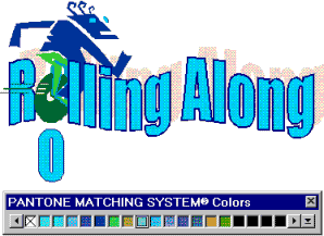
The execution of this design is very poor. As a piece of promotion I think it is very unsuccessful. The software package which this person has used to construct the logo is very dated and is reflected in the clipart and word art. The execution of Graphic Design affects whether or not I like it because I like design to be clean, crisp and professional.


No comments:
Post a Comment