
My rules were:
- All Design should be legible
- Colours should be appropriate to content
- All design should have a purpose
As a task we have to idenify 3 different examples of Graphic Design which fulfils each rule.
1. All Design should be legible

This is an example of packaging which I think fits with my rule as it is legible in two ways. One, it is an established brand which is easily recognisable and two because it has managed to stay true to its original design whilst incorporating a contemporary and quirky twist.

Coca Cola is one of the most famous brands in the world, it can be altered and still be recognisable. This experimental illustration is really interesting as it is different from the original branding although it stays true to some aspects.

I chose this piece of design because I liked the optical illusion with the use of negative space to create and image. I think this is legible because it is an image inside an image which is easy to distinguish.
2. Colours should be appropriate to content

The use of neutral colours for this bakery is very effective as it does not take any of the attention away from the product itself. I really like this as I am a fan of simplicity. If I was to produce design for a bakery I would think it would be similar to this.

The colours and stock used to produce this design fits the product perfectly. When people think of earl grey tea they think organic from the soil, this encompasses that perfectly. I also love the use of green as it brings a lightness to the design.

I think this design uses colour very effectively as it incorporates it into the actual product. The simple cream label mixed with the colour of the wine compliment each other very well and help the illustration stand out.
3. All design should have a purpose

I really like this piece of design as I think it conveys a powerful message in a way that makes people sympathise with. Some people would also be drawn to this design by the cuteness it conveys. It has a clear purpose and portrays it very effectively.

This design I find very effective. It has a clear primary function but is obviously humorous and entertaining. If I saw this I would find it very quirky and also interesting.

Info graphics are possibly the most functional piece of design as it does what is says on the tin. I like lots of info graphics but chose this one as I liked the quirkiness of it.
2. Find 5 other examples of creative practice that fulfil the rules you have chosen. These examples must not be Graphic Design.
1. All Design should be legible

Furniture is one of the few forms of creative practice which can be legible and illegible. I chose this piece of furniture because I feel it is in-between both forms. I think that once it is made clear what the purpose is that it is a very legible and interesting piece of design.

The Angel of the North in Newcastle is a piece of sculpture and architecture which I greatly admire. The design of this is very simplistic which is a favourite style of mine. I think the use of material also enables it to be very legible.

I do not have a large appreciation for Fine Art but I do love this painting. I think the way it has been painted has a great effect on peoples emotions and is also very well constructed.
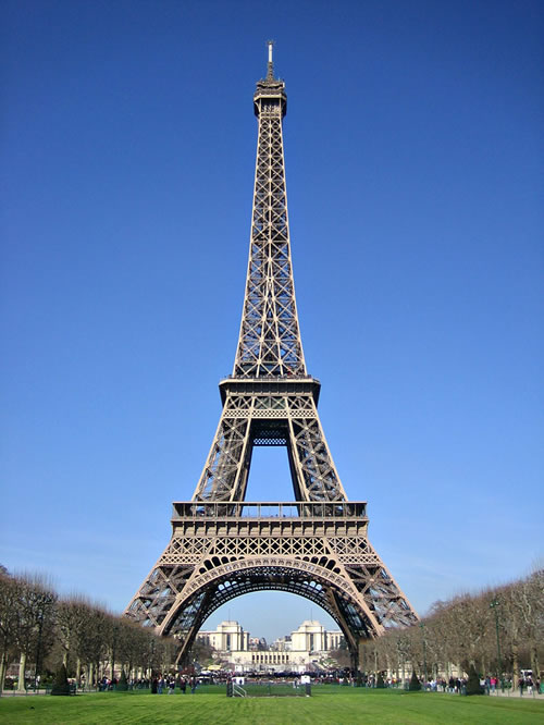
A piece of architecture I very much admire is the Eifel Tower in Paris. I think the use of material makes a great statement about Paris and France and also is very cleverly ironic as the iron matched with the greenery is very well thought out.

Product design is almost always legible so I chose one of my favourite designs from this avenue. I love the design of Apple products. They are incredibly simplistic and gender neutral. They also look very clean and professional which is a very important trait as it is to be used within a wide audience.
2. Colours should be appropriate to content

'Eco-conscious artist Jean Shin believes that the advancements in medical science have has escalated the overall consumption of prescription drugs which has increased our bodies’ dependency on these chemicals. In an effort to map the society’s chemical intake, Jean has created an art installation, which signifies that the issues of health reach far beyond the physical.'
Orange is a power color. It is one of the healing colors. It is said to increase the craving for food. It also stimulates enthusiasm and creativity. Orange means vitality with endurance. People who like orange are usually thoughtful and sincere. Lady luck's color is orange. source

The Taj Mahal is one of my favourite pieces of architecture. The colours in the design are very suitable for the content as white enables the building to stay cool. Like many buildings in countries with hot climates the Taj Mahal has been designed to reflect the sunlight rather than absorb it. I think by creating this building in white stone it has an aspect of romanticism and mystery about it.

Schindlers List is, in my eyes, one of the most powerful films I have seen. Shooting the movie in black and white was a stroke of genus as it enables the horror of the Holocaust to be showcased without the distraction of colour. Sometimes in film black and white is needed to ensure that the audiences full attention is on the story line and not the miss en scene.

The popular American show America's Next Top Model featured a photo shoot where each model was assigned a colour which matched their personality. The colour was splattered on each of their faces and a beauty shot was taken. The use of colour in this piece of photography was very clever as each girl brought a different emotion within each colour.

I have a strong appreciation for the practice of illustration. I particularly admire the work for the children's tv and book series Charlie and Lola. Not only do I appreciate the simplistic hand drawn illustrations I particularly admire the use of colour and patterns within the illustrations. As children can become distracted easily it is very important that what they are watching/reading grabs their attention. Part of this comes down to the use of colour in design. The bright and bold colours which are used grab attention and also appeal to both boys and girls which is very important.
3. All design should have a purpose


The impressive aquarium in Dubai is a perfect example of design with a simple purpose. The simple yet incredibly impressive design of this underwater experience enables the general public to see what they would not usually be used to seeing. I think the use of the 180 degree view is incredible and will be admired for many years.

Museums have possibly the most impressive installations. I think that many fine art installations are very admirable but they do not all have a clear purpose. This on the other hand is both visually pleasing and historically interesting.

Architecture is possibly the form of creative practice which holds the most purpose for me. Dubai international airport is a prime example of simplest architecture which is both minimalist and incredibly legible. The straightforward design of this airport is something I find very impressive.

Furniture is one of the few types of creative practice which can be as radical as it wants whilst also being incredibly useful. An example of this is a bookcase which is not the conventional shape it is known for. The use of the different shapes in this case makes the design appealing to a niche audience.

Fashion is a type of creative practice which can have purpose but can also not. Wedding dresses in my eyes have a very specific purpose as they are only often worn once in someones lifetime. My favourite wedding dress design was featured in one of my favourite films; Bride Wars. Kate Hudson wore a gorgeous Vera Wang wedding dress which I think was beautifully crafted and features my favourite type of design, simplistic.
No comments:
Post a Comment