Pentagram are a design studio who I like very much. I found one of their magazine layouts for a college in Vermont. I find this layout very appealing as it is clear and reads very well. I favour a structured layout as opposed to one which is harder for the eye to read and confusing to understand. I think for this brief I could be more adventurous with my layout option as we have been learning about interesting grids and layouts which are in use today.

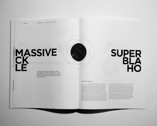
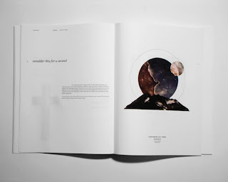
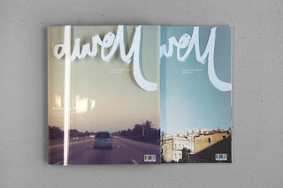
Publication produced Ani Bushry for a final project. The signature of this piece reflects my personal style, the clean crisp imagery and limited use of colour is very appealing to me. I find the layout very interesting but simple. The grid is very evident and consistent within the whole publication.
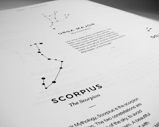
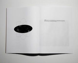
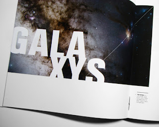
I like the layout and overall design of this Universe booklet. I find the minimalism very appealing and the way in which the information has been displayed makes it interesting to read and appealing to the eye. I would like to experiment with this idea within my publication.
Source
Fashion editorial design can take on many different layout and grid variations.












No comments:
Post a Comment