
- Coated and Uncoated papers
- Die Cut
- Emboss
- Deboss
- Litho Laminate
- Duplex
- Foiling
Initial Research on the web:
Varnishes
Varnish is often associated with wood. However, what you may not know is that varnishes are also used on paper. Paper varnishes are applied to paper stock to give the page a smooth and consistent texture as well as having the added benefit of sealing the printed material to help preserve it better. High-quality books and magazines usually have a paper varnish applied to their pages.
Varnishes can be glossy, as the example below shows:

Or matte (below):

Typically, varnishes are applied to the entire printing surface when a page needs to be robust but without adding too much weight to the paper stock, making it suitable for magazine pages, magazine covers, and brochures.
Lamination
Lamination adds a layer of protective coating (usually some type of plastic), often glossy or matte, to the printed surface while also improving its sturdiness and water resistance.
Lamination also has the added benefits of improving the tactile feel of the of the printed surface, lending it a smooth finish.
If a high gloss laminate is applied to the printed surface, photos and images appear to have more contrast and have better sharpness, as shown below:

Matte laminated prints are more subdued but add a very luxurious and elegant finish to the printed surface:

Lamination is not unlike varnishes. However, whether lamination or varnishes are to be used in a project is wholly dependent on your needs and your desired outcome.
Typically, lamination is used if sturdiness is required such as for business cards and soft covered books. Also, in my experience, lamination tends to be one of the more expensive print finishes.
Spot UV Varnish
Spot UV varnishes are paper varnishes applied to the printing surface and is cured or hardened by UV light during the printing process. This results in a glossy coating on the surface of your print, as shown below:

UV varnishes are usually used as a spot application where only specific parts of the page get a UV varnish.

This effectively gives texture and focal interest to different areas of the printing surface while leaving other areas untreated.


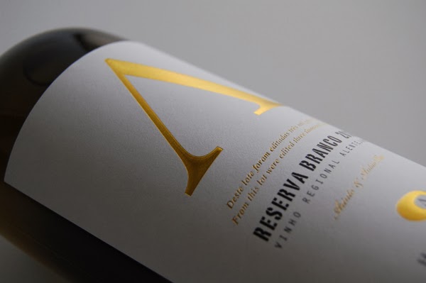
Foil stamping is the use of a malleable metallic material applied to the print surface by using heat and pressure.

Foil stamping adds reflective properties to various elements of your design and can serve to add a bit of luxury to your project.

Typically, it is used on text and the logo on the page or when certain elements call for it.

Embossing
Generally, embossing refers to raising parts of the page for emphasis and texture.

This print finish adds physical depth to the embossed elements and thus, shadows and highlights are also produced in the design.

Embossing also adds a tactile dimension to your design. Images and text are literally felt.

Often, embossing can be combined with other printing techniques such as foil stamping to enhance the effects of both techniques.
Letterpress
Letterpress printing is one of the oldest printing techniques available. Some printers may call letterpress printing by the term debossing.


A letterpress is used to depress or indent certain portions of the page. It can be seen as the opposite of embossing.

Traditionally, the letterpress technique was used only for applying ink on a page as a form of relief printing and usually only for text. But it has evolved to also include pressing logos and other design elements directly into the paper substrate.

Blush Publishing
I was looking at some print finishes on Pinterest and came across an article which linked me to Blush Publishing. Their website is very succinct and tells the user exactly what print method has been used and what finish it has applied to it.

Client:
The First 65
The First 65
Designer:
The First 65
The First 65
Stock:
Colorplan Duplex
Colorplan Duplex
Inks:
Silver / tint
Silver / tint
Finishing:
Edge colour
Edge colour

Client:
Brain Up
Brain Up
Designer:
Brain Up
Brain Up
Stock:
700gsm Colorplan
700gsm Colorplan
Inks:
Black / Green / Grey
Black / Green / Grey
Finishing:
Edge colour
Edge colour

Client:
Delaine Gardner & Adam Coppack
Delaine Gardner & Adam Coppack
Designer:
Adam Coppack
Adam Coppack
Stock:
300gsm Somerset Cotton
300gsm Somerset Cotton
Inks:
2 colours both sides
2 colours both sides
Finishing:
Crease
Crease


Client:
Samantha & Elliot
Samantha & Elliot
Designer:
Elliot Jay Stocks
Elliot Jay Stocks
Stock:
1000mic Cairn Board
1000mic Cairn Board
Inks:
Black / Green
Black / Green
Finishing:
Die cut corners
Die cut corners

Client:
Genius Division
Genius Division
Designer:
Genius Division
Genius Division
Stock:
540gsm Colorplan Duplex
540gsm Colorplan Duplex
Inks:
Red / tint
Red / tint

Client:
Netfélagid
Netfélagid
Designer:
Jökull Sólberg
Jökull Sólberg
Stock:
540gsm Colorplan Black
540gsm Colorplan Black
Inks:
Silver
Silver

Client:
The Ubiquitous Manufacturing Company
The Ubiquitous Manufacturing Company
Designer:
The Ubiquitous Manufacturing Company
The Ubiquitous Manufacturing Company
Stock:
1000mic Cairn board
1000mic Cairn board
Inks:
Silver / tint
Silver / tint
Finishing:
Edge colour
Edge colour

Client:
WRK
WRK
Designer:
Mark Lindop
Mark Lindop
Stock:
650mic Cairn board
650mic Cairn board
Inks:
Silver
Silver
Finishing:
Edge colour
Edge colour
Looking at Blush Publishing's Blog:


Task:
With a focus on stock, substrate and 'special' print finishes find as many variants as possible for each of the following design areas:
- Branding and Identity
- Packaging and promotion
- Publishing and Editorial
- Information and Way-finding
(Primary research would be more appropriate when possible)
Branding and Identity:

Liz Earle logo - Embossed

InForm architects branding - varnish and debossing
Packaging and Promotion:


Publishing and Editorial:


Information and Way-finding:


Fleur De Lys - foiled

Packaging - die cut

Coffee Packaging - Embossed


Expatrius Estate - hand etched crown, gold foil emboss
Publishing and Editorial:


Pasta book - foiled
Information and Way-finding:

Custom Embossed Wayfinding
Primary Research - Foiling:


