Showing posts with label Design for Web. Show all posts

Saturday, 23 November 2013

OUGD504: Design Production - Design for Web Research Children's Websites

As I am aiming my website at children and teachers I have to make sure that I have an understanding of what layout and design to be aiming for. I have looked at some websites which have the same target audience as my own.


CBBC Games

This website is for CBBC which is an online resource for children to play games and learn as they play. This site is for the older children whereas Cbeebies is for younger children. The aesthetics of the site are very stereotypical for the target audience, big bright colours and lots of moving images on each page to grab the attention of the target audience. I want to make my website appeal to children but also quite clean and modern to appeal to the teachers and parents.


Nickelodeon is the most popular children's website online at the moment and like the CBBC website the aesthetics are very stereotypical. Nickelodeon is not as busy and colourful as CBBC which I personally think allows the child to pay more attention to one thing at a time rather than everything at once. I want to adopt this style for my website because I think it is more important to focus on one thing especially for my purpose. 


The Horrible Histories has been popular with children for many years and they have a particular signature for their branding, I was slightly surprised at how minimal the website actually is, I expected a busy and cluttered page with lots of things going on. It was a pleasant surprise to me because I favour more minimal web design.

Oxford Owl 


For School


For home


Oxford Owl is a website with a section for teachers and for children, they differ significantly which could be quite confusing if a child was trying to access the site at home rather than at school. I do however, like the design of the site for children specifically, I think that the sky as the background makes the page very inviting and also does not take away from the information and links to other pages. The teachers site is very simply and clear which is a positive because it is easy to navigate around.


Nick Jr is for younger children which are not really part of my target audience but I did want to show the site for its background. I think the Oxford Owl background is just the right amount of image to keep the attention of the child on the important part of the site whereas this site has a busy background which I do not think is necessary. 

Thursday, 21 November 2013

OUGD504: Design Production - Design for Web London Underground Documentary

I found this documentary detailing the history of the London Underground. It is really interesting and informed me about a lot of things I do not know about the tube. I have looked at this specifically because I plan to create a video about the tube history for my website. 


My Notes:
  • Farringdon station was the first station to get an underground train
  • The tracks are 630 volts
  • Farringdon is prone to flooding due to it being built on the banks of a river
  • 1850's London faced a problem of too much traffic
  • A Law was passed during the boom time to stop stations being built in central areas. As a result of this the stations were built on the edges of London (Paddington, Euston, Kings Cross)
  • With no access to the square mile the streets were full of people
  • Charles Pearson who was the solicitor for London had concerns about the transport system 
  • With no transport in or out of the city workers were placed in slums, they dreamed of the countryside
  • In 1845 Pearson had an idea to have trains underground
  • He tried to make this happen for 8 years and was unsuccessful
  • In 1863 he changed his tactics and the house of commons allowed the railway to be built
  • This saw the formation of the Metropolitan railway group which was a private
  • The building was a difficult process 
  • The first lines were built using the cut and cover method
  • This process cleaned out the slums because they had to move them to build the tube
  • This was a positive for the middle class but not so much for the lower class
  • The line was formed from Paddington east to Farringdon
  • Paddington - Euston - Kings Cross - Farringdon
  • There were many options for the trains but the company chose the cheapest option - steam
  • The prime minister was invited to the grand opening but declined
  • They invited as many politicians and investors as they could to a banquet at Farringdon
  • 9th 1863 the first ever train pulled away from Farringdon
  • On the first day Farringdon had to close due to over crowding
  • In its first year the tube was in such high demand that services were increased to every 10 mins
  • The more trains meant more sulphur in the atmosphere
  • They ran a PR campaign promoting steam and saying it was good for passengers health
  • 1868 the District railway opened
  • Rival companies joined and drew a circle around london in 1884
  • The lines were all shallow due to the way they were built
  • 1890 a revolutionary piece of equipment changed that
  • The great head shield was a tunnelling machine pioneered by the Brunell family
  • This machine meant it was able to dig through clay
  • Labourers would crouch in the compartments and dig, this machine would then move along the tunnel which would increase in size
  • 1890 the City and South London railway pioneered that machine digging the first tunnel under the river Thames from Stockwell to the city
  • There are dozens of unused stations on the tube
  • Some even have the old war posters on the walls
  • More and more companies opening new lines
  • Waterloo and City Line 1898, Central 1900
  • Electricity drove the expansion of the tube
  • Trains ran on electricity instead of steam
  • Tiling patterns became very important in identifying stations
  • People could not read and write in this time so they used the colours of the tiles to identify the stations
  • Companies who had lines did not work together so a separate ticket needed to be bought to cross lines
  • 1933 the London Transport was formed which brought all the companies together
  • Design was made the same so that it was consistent
  • This was a visionary design change
  • The London underground is an international brand
  • 1929 - 55 Broadway was built as the headquarters for the London Underground
  • Frank Pick was the director at the time
  • He went all out on the design of the tube
  • The circle and cross logo has now been the logo since 1908
  • There are rumours that it was stolen from the Paris tube
  • Pick had ideas to boost sales and built 7 more stations which were overground lines. These gave easy access to the underground from various locations
  • The tube created new suburbs and extended the London borders
  • The tube map was a complicated tangle of different lines
  • Harry Beck who was a electrical draftsmen took it upon himself to design a new map
  • He focused on the joins and where the lines clashed
  • He made sure that every angle was either 45 degrees or 90 degrees
  • Ken Garland was friends with him and has been left with the original design from Harry Beck. He called it amazingly elegant
  • In 1932 Harry Beck was unemployed 
  • He sent the design to the underground the plan and it was rejected 
  • He went back and they eventually accepted it but wrote a note on the back asking for comments from the public about the design
  • The public loved it and it went very quickly
  • They printed a trial run in 4 stations and it was very popular
  • The map was drafted by hand by Harry Beck
  • 1950 disagreements were made by Harry and the TFL about geography
  • 1960 Beck went to a station and was surprised when he was met by a version of his map which was signed by someone else
  • He carried on sending maps in they were rejected
  • 1997 he was credited on the map from then to present
  • Map changes every 6 months
  • Beck's design influenced metro system maps globally
  • When the car became more popular the tube suffered 
  • 1956 they came up with a creative solution
  • They recruited immigrants from Jamaica and Barcelona and put them up in hostels
  • Racism became a problem and they were not allowed to stay in b&b's
  • 1982 the numbers of passengers on the tube dropped 30%
  • It became a source of inspiration for photographers
  • 18th November 1987 at Kings Cross station there was a fire which killed 31 people. The heat was so intense that it melted the ticket machines
  • The fire was caused by a cigarette which was stubbed out, this would not have been such a huge problem had the escalators been cleaned and were they not full of flammable liquids
  • The tube is now undergoing a £1bn upgrade
  • The oldest station (Farringdon) will soon become the newest
  • It is predicted that in 2018 Farringdon will have 150 trains per hour

Wednesday, 20 November 2013

OUGD504: Design Production - Design for Web Inspiration

The content of my website lends its self to information graphics, with this in mind I have looked at some existing websites which are information graphic lead and use them in a way which makes it easy for people to navigate around easily.

100 Ans De Tour
Source


Homepage (index)

I really like the aesthetic and how easy it is to navigate around. I am not a fan of the colour yellow but this links to the subject matter which is the tour de France. I was not aware of this site because I am not part of the target audience which is a shame because it is such a nice website. When it comes to designing my website I have many facts and figures to display which I want to do in a visually pleasing way, this design does just that. The information graphics are used because it is a global tournament which means that language barriers will need to be addressed, my subject has the exact same problems.


A list of dates which each link to a separate page of the site.


When one is clicked it opens into another page with a map of the world.


The site will zoom into the map and shade the country in black which helps the audience to see visually where the event happens. There is also a rectangle in the bottom corner made up of smaller rectangles which gives the information and figures from that year. This is written in French but it is not noticeable due to the design of the site and the information graphics used. 


In the top left hand corner of the site there is an option which links to three other pages with information graphics to display facts and figures about the competition. These are really modern and interesting to look at. 


The imagery used are very specific to the subject and allow the audience to constantly relate back to the initial subject. 


Colour is not used unless it is to define a different country which adds to the simplicity and minimalism of the site. 

I think this idea could be developed and work for my site. I would have specific features which apply to my subject matter which would hopefully encourage the target audience to interact and engage with it. 


Martina Sperl
Source

This website is promoting a furniture maker, her site is incredibly simple and image based which I think is very inviting and also allows the user to be as lazy as they might want to be. Her site is designed very well though I think her navigation bar should always be visible and not just show when the person hovers over the right hand side of the page.


Navigation bar appears once the user hovers over the right hand side of the page. This is a nice effect to keep the images as the main focus but I think that some people would get lazy and decide to leave the page because they do not want to look for the navigation bar. 


Bruce Gillingham Pollard


Numiko


Tuesday, 19 November 2013

OUGD504: Design Production - Design for Web London Underground Map Through the Years

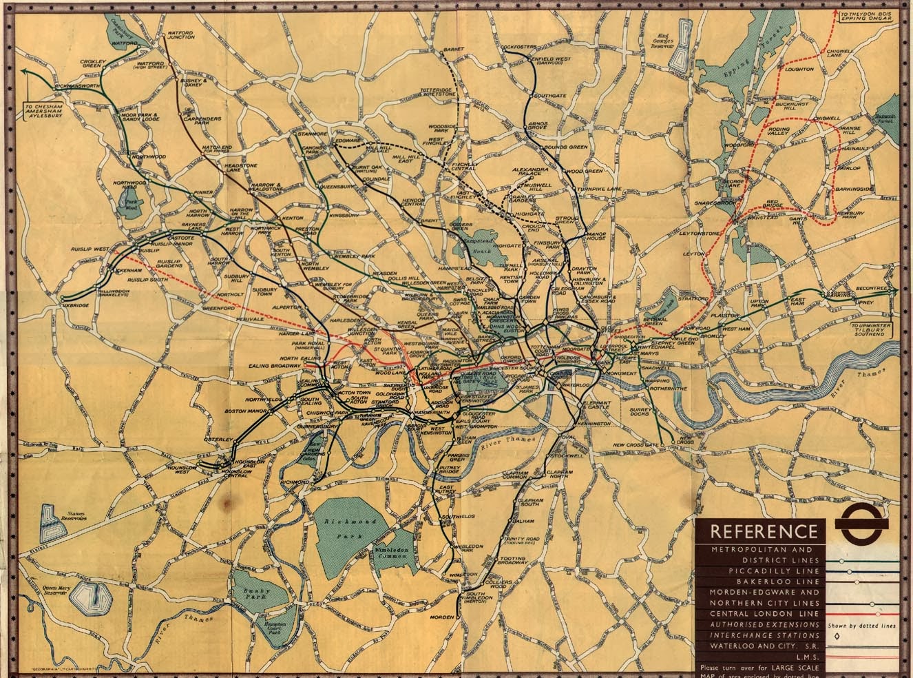
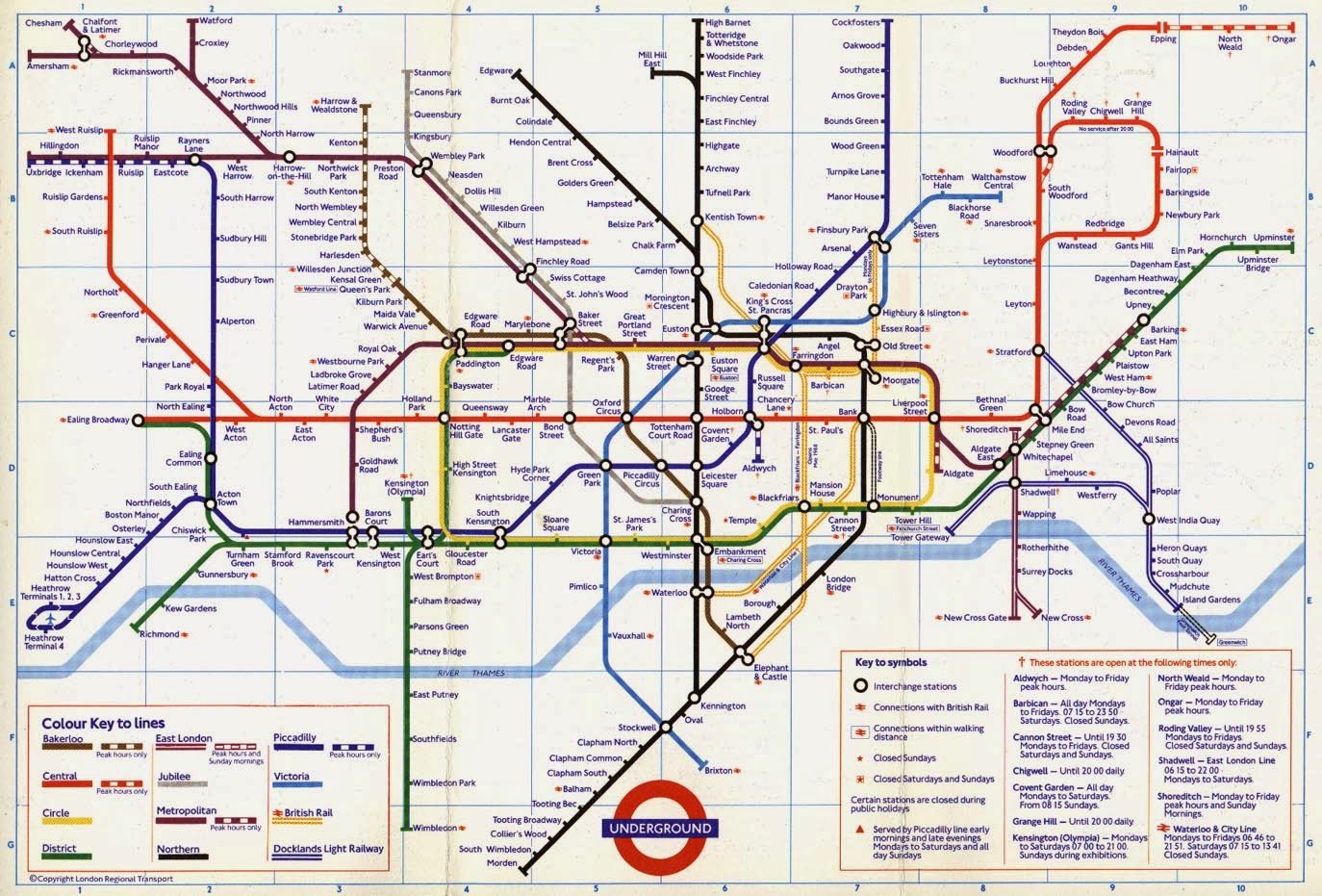
This timeline illustrates how the tube map has changed throughout the past 90 years. There is a clear development within the design doing the 1930's which is when Harry Beck first designed his own version of the map. 


1908


1921


1933


1937


1937


1938


1938 Version 2


1945


1948


1951


1951


1958


1960


1964


1968


1970


1972


1977


1985


1987


1994


1998


1999


OUGD504: Design Production - Design for Web London Underground Map Design

Harry Beck's tube map revolutionised the world of graphic design and specifically information graphics and way finding. I have been looking over the past few months at design which is inspired by the Harry Beck tube map and I have found that many other tube systems have used the design as a template for their own way finding. There are also some artists and designers who have taken inspiration from the tube map design. I personally love the tube map design and the functionality of the simple and clean lines. I have added images of the work I have found interesting over the time I have been looking into this subject. 


I found this brain very interesting, the fact that Harry Beck's concept has been altered to represent something so vital as a brain is very interesting and is also a credit to the design itself. I think that the different coloured lines in this brain would be great to educate people about their own brain. 

The brain concept was an advertisement by HSBC. 


The Manhattan tube map is said to be greatly inspired by Harry Beck's tube map. Though the layout is significantly different due to geographical location there is a clear link to Harry Beck's design. This design is an adaptation of the Manhattan tube map which has been produced in different colours to act as a piece of design rather than something which people will use.