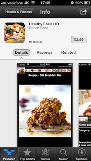
Looking at other apps available...
From the apps I have gathered the overall style and layout is very similar. I think to make our app stand out we will have to create a one of kind, unique design which appeals to our target audience; students.
To create our poster we have had the idea of using an info graphic style to get our point across.
I think this style is probably the best for us to take influence from. The simplicity will appeal to students and it also looks graphically interesting.
The above info graphics are just a few of the examples I have found. I think we will have to make ours quite different maybe by using more radical colours such as orange.


No comments:
Post a Comment