If I decide to make an actual pack of different things rather than a book I want it to be quite bespoke and special. This mailshot has been designed very simply but the opening makes it quite special and would also make the audience feel a bit more inspired to open it. When it comes to the tone of voice within my design I could go for something quite direct like a mailshot or something quite soft like a book or a series of posters, these are things I will have to look into when I have gathered all of the content.
Last year I discovered information graphics and found it really interesting and used the design ideas alot in my work. I really like this astronaut information graphic because it is simple, easy to identify (with the image attached) and gives interesting information in a broken up form which is easy to read. If I were to produce a series of posters as my information pack this could be a great idea and would also make each sheet quite individual and could be used as a decorative but informative decoration.
Simple illustrations either hand rendered or vector images with a splash of colour added with a shape or ink. I think this would look really effective and could also be a good way to prioritise the information I am displaying.
I think producing illustrations like these which I found on Behance would be really visually pleasing. When it comes to displaying the machinery used I was leaning towards Photography but due to the amount of time we have been given to produce this brief and my lack of photography experience this might not work.
I found this book by one of the designers I follow on a regular basis. I think it is very interesting and extremely engaging with the audience. What I like most about this design is that it makes you think which I think is very important. She has used very design specific ways to portray a different aspect of visual language and this makes it very appealing.
I am a huge fan of information graphics and especially editorial design which uses information graphics to say something. I found this book on Behance which is about one man and how many places he has visited and the time he has spent in those places. I particularly like the design of the book as it is so simple and easy to read. I do not like the colour he has chosen to use but I do like the minimal amount of colour he has chosen to print in. I could very easily produce something like this for my information pack but I want to step out of the box I have put myself in.
My idea is create something which is packaged. I am not particularly gifted in this area but I would like to improve on my packaging skills this year. I found this pack on Behance and think it would be a great concept for my information pack. I want to create a manual type book about print but I also want it to consist of more than just a book. I would like to produce a visual timeline of print or one specific type of print such as letterpress. I could do this type based or image based like above but I think it would broaden the range of my creativity and also be a better way to illustrate the history in a visual way.
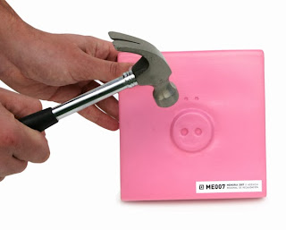
At the other end of the spectrum I could make my pack very interactive. I found this book on Behance and I think the idea is brilliant. They have played on the breaking piggy bank idea to reveal the book, this makes the book seem much more special because people usually break their piggy banks when they have saved up for what they want or in an emergency. I don't think this idea would work for this brief but it is certainly very interesting.


No comments:
Post a Comment