Typography - Richard Miles
A history of type...
Aims
- History
- 6 Main classifications
- Famous typefaces
- Metalinguistic function
- Kerning and x-heights
Calbri, Gill Sans, Curls MT, Comic Sans
Typography exists at the interception of Visual communication and Verbal communication.
Typography - Meta-communication, Paralinguistic's, Kinesics
Language is an organised way of communication. Typography is a meta-communication that can change communication. Typography can affect the speed, rhythm and way we read a language.
'Do I look fat in this paragraph?
type is broadly classified into 6 families.
In the mid 15th century (1450's) the age of print. The guttenburg press was invented. It uses moveable typeform which could be moved into different layouts and mass produced. Before this was invented type was only ever produced by hand. For the first time literature, knowledge and the printed word was available for the masses.
Marshall Mcluhan - media theorist 'late age of print'
A lot of our alphabet comes from the Romans. The oldest type record. The reason why we have serifs is because letters were originally chiseled from stone which meant that serifs were added to the end of letters.
Based particularly on medieval script handwriting. Reproved by the Nazi's.
These were supposed to reflect handwriting though they had a greater kind of elegance.
Geofroy Tory believed that proportions of the alphabet should reflect the ideal human form. He wrote ' The cross stroke covers the man's organ of generaton'
Humanist typefaces which have been redesigned to suit contemporary tastes.
15th century - Venice. Explosion of typography. Typography takes hold as a design discipline. Further move away from script and move towards a more rational logic. (slanted ascender has gone horizontal)
A lot of the fonts that are supplied on a computer were based on the old style fonts from Venice.
England and Europe (France) mid 18th century. Really famous typographer called William Caslon developed a font.
A gradual move through Humanist, Old Style and Transitional typography.
Modern or Didone typefaces. First one made by Firmin Didot (french typographer) The most well known is called Bodoni.
No brackets, no attempt to look like handwriting, ultramodern.
Didone fonts get used a lot in fashion. Glamour, style, sophistication.
It doesn't actually look like the Egyptian type, it is more of a reference to orientational area. Designed to be fonts that can shout at you - not made to get lost. Ugly, brash, designed to grab attention.
Fat face - inflated hyperbole type style.
Font of mass marketing.
Modernist sans serf type faces. International, design language for all, modern, progressive, not historic.
Nazi's used Fraktur to show their superiority.
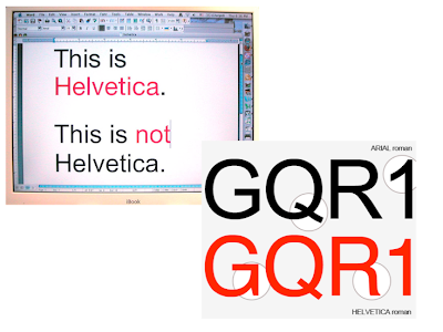
Helvetica - can't go wrong with or boring.
Modernist or Post-Modernist
David Carson - Grunge type
Black letter typeface called Bastard - to be used by corporate wankers.


No comments:
Post a Comment