Sunday, 20 October 2013

OUGD504: Design Production - Design for Print Design Research


If I decide to make an actual pack of different things rather than a book I want it to be quite bespoke and special. This mailshot has been designed very simply but the opening makes it quite special and would also make the audience feel a bit more inspired to open it. When it comes to the tone of voice within my design I could go for something quite direct like a mailshot or something quite soft like a book or a series of posters, these are things I will have to look into when I have gathered all of the content. 


Last year I discovered information graphics and found it really interesting and used the design ideas alot in my work. I really like this astronaut information graphic because it is simple, easy to identify (with the image attached) and gives interesting information in a broken up form which is easy to read. If I were to produce a series of posters as my information pack this could be a great idea and would also make each sheet quite individual and could be used as a decorative but informative decoration. 


Simple illustrations either hand rendered or vector images with a splash of colour added with a shape or ink. I think this would look really effective and could also be a good way to prioritise the information I am displaying. 


I think producing illustrations like these which I found on Behance would be really visually pleasing. When it comes to displaying the machinery used I was leaning towards Photography but due to the amount of time we have been given to produce this brief and my lack of photography experience this might not work. 


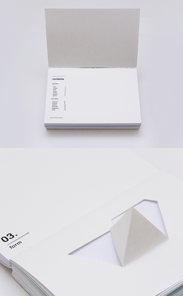
I found this book by one of the designers I follow on a regular basis. I think it is very interesting and extremely engaging with the audience. What I like most about this design is that it makes you think which I think is very important. She has used very design specific ways to portray a different aspect of visual language and this makes it very appealing. 


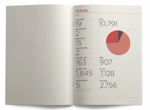
I am a huge fan of information graphics and especially editorial design which uses information graphics to say something. I found this book on Behance which is about one man and how many places he has visited and the time he has spent in those places. I particularly like the design of the book as it is so simple and easy to read. I do not like the colour he has chosen to use but I do like the minimal amount of colour he has chosen to print in. I could very easily produce something like this for my information pack but I want to step out of the box I have put myself in. 


My idea is create something which is packaged. I am not particularly gifted in this area but I would like to improve on my packaging skills this year. I found this pack on Behance and think it would be a great concept for my information pack. I want to create a manual type book about print but I also want it to consist of more than just a book. I would like to produce a visual timeline of print or one specific type of print such as letterpress. I could do this type based or image based like above but I think it would broaden the range of my creativity and also be a better way to illustrate the history in a visual way. 


At the other end of the spectrum I could make my pack very interactive. I found this book on Behance and I think the idea is brilliant. They have played on the breaking piggy bank idea to reveal the book, this makes the book seem much more special because people usually break their piggy banks when they have saved up for what they want or in an emergency. I don't think this idea would work for this brief but it is certainly very interesting. 


Friday, 18 October 2013

OUGD501: Context of Practice - First Things First Task

There have been a number of authors that have considered the role of a designer within Advertising,  Garland, K. 'First Things First Manifesto' (1964), Poyner, Lasn et al (2000) 'The First Things First Manifesto 2000', Poyner, R (2000) 'First Things First Revisited' and Beirut, M. (2007) 'Ten Footnotes to a Manifesto' have all commented on the consumerist culture and the role of a designer in promoting items that are unnecessary and unethical.

Garland highlights his disappointment in designers ‘applauding the work of those who have flogged their skill and imagination to sell such things as; cat food, stomach powders, detergent, hair restorer, striped toothpaste, aftershave lotion, berforeshave lotion, slimming diets, fattening diets, deodrants, fizzy water, cigarettes, roll-ons, pull-ons and slip-ons’ (Garland, K. 1964) here Garland lists items that do not have a set purpose or function, he believes that designers are giving into consumer culture and have ‘sold their soul’ to make money. Similarly, Poyner, R (2000) states that ‘ commercial work has always paid the bills, but many graphic designers have now let it become, in large measure, what graphic designers do.’ (Poyner, R. 2000) given the 26 year gap between both manifestos it is clear that consumerism is continuing to grow and more designers are beginning to abandon their ethical beliefs for money.


An example of this is shown in the advertisement for Viceroys cigarettes (fig1). The tagline reads ‘as your dentist I would recommend Viceroys’ this goes against any ethical beliefs that a designer might have had as cigarettes are not healthy and can seriously damage a persons health. By using an image of a dentist this advertisement sends a negative message to consumers that smoking is good for you. Bierut said ‘and in the ecosystem of the design disciplines, graphic designers have long dwelled at the bottom of the pond’ Bierut, M. (2007) this states that no matter how much good one designer tries to do, there will always be a group of other designers ready to abandon their ethical beliefs for a campaign with a huge company that exploits peoples health and wellbeing. A contrasting argument to this would is shown in the advert for cancer patients, figure 2. In this advertisement a shocking image shows an adult laid on a table with a small child inbetween them. By using an image like this the ethics of smoking has been reinstated and correctly represented. Poyner, R said ‘the imbalance identified by First Things First is greater than ever. The vast majority of design projects and certainly the most lavishly funded and widely disseminated – address corporate needs, a massive over-emphasis on the commercial sector of society, which consumes most of graphic designers’ time, skills and creativity’ (Poyner, R. 2000) this further highlights the argument that commercial companies have begun to exploit a designer and remove their ethical beliefs to sell products that are bad.


Thursday, 17 October 2013

OUGD501: Design Context - Consumerism Lecture Notes

Consumerism: Persuasion, Society Brand and Culture


Aims:
  • Analyse the rise of US consumerism
  • Discuss the links between consumerism and our unconscious desires
  • Sigmund Freud
  • Edmund Bernays
  • Consumerism as social control


Century of self - Adam Curtis 2002

No Logo - Naomi Klein 1999

Sigmund Freud (1895 - 1939)
  • New theory of human nature
  • Psychoanalysis
  • Hidden primitive sexual forces and animal instincts which need controlling
  • The interpretation of Dreams (1899)
  • The Unconcious (1915)
  • The Ego and the Id (1923)
  • Beyond the Pleasure Principle (1920)
  • Civilisation and is Discontents (1930)
Freud's model of personality structure:

The conscious is buried under the surface..


1930

  • Fundament tension between civilisation and the individual
  • Human instincts incompatible with the well being of community
  • The Pleasure Principle

WW1 - was a testament of all his beliefs and ideas. WW1 was to epitome of all his thoughts.

Edward Bernays (1891-1995) Sigmund Freud's nephew
  • Press agent
  • Employed by public information during WW1
  • Post-war set up 'The Council on Public Relations'
  • Birth of PR
  • Based on the ideas of Freud
  • Crystallising Public Opinion (1923)
  • Propaganda (1928)
Touches of freedom

1929 - Easter day parade
Women were not known to smoke - it was frowned upon. 
Bernays was employed by a tobacco company to try and get women to smoke. 
He created a publicity stunt. Paid debutantes to walk down the parade, he tipped off photographers, girls lit up cigarettes, he fed a story to the press that the women were a bunch of suffragettes and it was a political opinion.

He believed that he could make people want something by simply advertising it. 

A cigarette became a symbol of power and sex appeal.

American mass production:

  • Product Placement
  • Celebrity endorsements 
  • The use of pseudo-scientific reports
Linking a celebrity to a thing automatically makes it seem that it is part of the celebrity and lifestyle which many people aspired for. 

Politicians got involved with the campaign. The president of America hired Bernays to make him seem more interesting and gain more supporters. He was re-elected on the back of Bernays campaign.

Fordism
  • Henry Ford (1863-1947)
  • Transposes Taylorism to car factories of Detroit
  • Moving Assembly line
  • Standard production models build as they move through the factory
  • Requires large investment, but increases productivity so much that relatively high wages can be paid, allowing the workers to buy the product they wanted
The importance of brands:

This the start of consumer culture and branding. Branding emerged when more products were introduced. Rivalry was brought into society. Brand images help to relate to a real person and make it seem more special. 

Aunt Jemima's pancake flour:

Did not sell at first because house wives felt guilty/ they were cheating because they did not make it themselves. Aunt Jemima changed their product to involve the TA more. They made the mixture need an egg cracking into it which made it more popular. 

Car adverts became penis extensions. Advertisements played on the mens masculinity to make men feel like they had to have one or they would nots seem manly.

Desire :


People did not need any items so this meant that a false desire was created and made people feel like they needed the items when they actually didn't. 

The Hidden Persuaders
Marketing hidden needs


  • Selling emotional security.
Freezer studies - do not save lots of money they spend more than you need

The emotional security of having food in the freezer is reassuring for a family.
  • Selling reassurance of worth 
  • Selling ego-gratification
  • Selling love objects
  • Selling sense of power
  • Sense of roots

1920
A new elite is required to manage the bewildered herd 
'manufacturing consent'


Russian Revolution 1917


October 24, 1929
'Black Tuesday'

Profit rose significantly until the biggest crash on Black Tuesday. Lots of people lost their jobs, the start of the great depression. 

Roosevelt and the 'New Deal' (1933-36)
  • Came in on the back of a promise to introduced welfare and benefits. 
  • Mass scheme of jobs creation.
  • Investment with industry.
This was really unpopular for big businesses. They were anti-roosevelt.

Worlds fair:
  • Giant exhibition in New York
  • Buildings specifically made for it
  • All that is great about American culture
  • Edward Bernays was behind it
  • Model of how the world would look if they replace their faith in the government
Democracity:

  • Model of how the city would look
  • You can only be free if people start spending again
  • This future will be yours if you ignore political parties


YOU ARE NOT WHAT YOU OWN.


  • Consumerism is an ideological project
  • We believe that through consumption out desires can be met
  • Consumer self
  • The legacy of Bernays/PR can be felt in all aspects of C21st Society
  • The conflicts beween alternative models of social organisation continue to this day
  • To what extent are our lives free under the western Consumerist system


Wednesday, 16 October 2013

OUGD501: Context of Practice - Communication Theory Seminar

Communication theory....

The Shannon-weaver mathematical model, 1949
They were under the employment of the American industry and asked to maximise communication efficiency.

This was specifically designed for telecommunications but it has become a very popular and famous model. It is not flawless but it is simplistic though the simplicity can sometimes be difficult to produce results from.

Broadly - your communications have 5 distinct stages. It is really important to understand how they relate to each other.

A very general understanding if communication and it broken down into 5 stages.

The process of communication

Information source
Transmitter (encoder)
Channel
Receiver (decoder)
Destination

An example would be a telephone - speak into the phone, it is transferred to signal, it is received and encoded then it reaches it's destination.

We were asked to come up with a communication model for graphic design.

The process of graphic design in terms of communication:

Problem
Communication
Defining
Feedback
Solution

These are very broad terms and can be significantly broken down into smaller and more refined steps depending on what the design is.

When giving feedback Richard said that we had not properly answered the question of communication but the design process.

Client/idea
Graphic designer
Platform
Target audience
Message delivered

Richard gave us a list which was more suited to communication within design.

What problems could occur at each of the five stages which could stop the information being communicated at the end?

Being given the wrong information
Poor communication with client or target audience
Little attention paid to target audience
World events which effect the audiences perception (eg. Gangster squad)
Poor print quality
Lack of development
Costing problems

Information source-
wrong information through bad communication (badly briefed)
Being given little information (broken info)
Conceptual problems within the idea

Encoding-
Poor interpretation of information
Rushed design (not enough time)
Consideration of the audience within the design

To encode a message we need to emphasise with the decoders
Look into the target audience and ensure that they will understand the design

Channel-
Printing problems
Costing
Location of the design (context of the channel)
Format and platform

Reciever-
Could be offensive
Misinterpreting
Language (understanding the destination)
Tone of voice

Destination-
Lack of feedback

Preventing breakdown of communication:

More quality research
Experimenting and development
Feedback from target audience
Planning
Speaking to audience in their language - limit communication problems

Consider possible limitations of a channel:
Print was bad or an Advert put on at a silly time then make sure our design is strong enough to stand out with these limitations

The noise source:
Shannon and weaver use noise as anything that interferes with the communication.

Eg. Telephone noise- This is literal noise

Other noise that could interfere with the information source:

Pressure from money men
The client
Company graphics
The company itself (primark) ethical noise

Encoding
Personal style of the designer
Personal life distractions

Channel
Design being weathered - billboard/poster
Limitations of the media - technical faults

Decoding
Prejudice of opinion
People having different visual language (not understanding)
Colour blind/deaf
Where it is - too cluttered - distractions

Destination
Sub cultural opinion
Popular opinion
Prejudice opinion

3 levels with the communication model

Level A technical problems
How accurately can the message be transmitted ?

Level B Semantic Problems
How precisely is the message conveyed?

Level C
How effectively does the received meaning affect behaviour?

Put the problems we just came up with fall within each category

Technical problems:
Badly printed
Design being weathered
Broken laptop
Problems with software
Rubbish designer


Semantic problems:
Incorrect target audience research or relation
Location and placement
Mis-interpretation of message being sent and received aswell as the brief
Tone of voice
Colour schemes
Visual language

Effectiveness problems:
People's opinion
Prejudice opinion
Offensive language
Ethical
Location of the message

Noise:
Anything unintended added to the signal between transmission and reception

Zines : very noisy - text falls off page the quality is bad.
The noise of the zine has become an aesthetic feature
Designers can embrace and aim for noise with their design

We might want to be the noise which hijacks the channel.
Subversive noise -mcdonalds billboard and esso logo.
Esso logo with red tape through the s's to make it look like dollar signs
All graffiti aims to be noise.

Noise is not just a problem, sometimes it can be the outcome or the solution.

Redundancy vs entropy....

Concepts which are vital and essential for us to understand

They are both about what is communicated.

Something which is redundant is not going to prevent communication - smooth

Entropy is unpredictable. It is not smooth.

Redundant:
High predictability
Low information

Our entire society is based around it. We depend on it just to survive. It is something that is generally really successfully because it carries low information and the content is quite conventional and predictable.

Someone who is interested in communicating to a wide audience will ficus on redundant communication.

Redundant does not mean unimportant.

Examples...
Greetings are redundant
- tapping into an agreed consensual code.
Mcdonalds communication is so stripped down to make it simple and easy to go through.

Entropy
If someone were to offer their hand to shake it and have an electric buzzer in his hand it would be entropy.

It is unexpected. Maximum unpredictability.
Unconventional. High information.

We might need to something entropic simply to get attention.
Make people question it or think about it.
We loose communication for information.

Fine art - trades off the entropic. Very niche audience.


Task:

Apply Shannon and weavers model to an example of communication. How widely is this applicable? How useful do you find this sort of example?

What are the main communicative functions of redundancy? What do we mean by saying the English language is 50% redundant.

Discuss the ways in which convention can be said to facilitate understanding. Think of visual communication that breaks or extend specific conventions. How does this affect the desire to communicate or the audience they reach?

Example, daily mirror:

The photo by itself is very entropic. It could look like the police are going to hit the lady.

Paper loads the image with two meanings the confrontation and the demo.

The surrounding visual imagery and type makes the image look less shocking and gives it context. 

Tuesday, 15 October 2013

OUGD504: Design Production - Design for Web

Part 1
The history...
1991 - the invention of the internet.
CERN is the facility in Switzerland where the byron collider is kept.
CERN = The European organisation for the nuclear research.
It was here that the internet was invented.

Tim Berners Lee invented the internet to make it easier for the scientists to share their information easily.


to link and access information of various kinds as a web of nodes in which the user can browse at will

At the start the internet was only available at CERN site in Switzerland.
Steve Jobs was the first person to invent Web Servers. This made it possible for the internet to be used by more people. He created the NeXT computer.


1992 - The first image was an all girl pop group founded by CERN.
It was png. format which is a universal form. JPG. is another universal format which is more commonly  used today.


Part 2
Terminology

All websites are made out of code.
HTTP - Hyper text transfer protocol
transfer between web and our eyes. The code and the website.
URL - Uniform Resource Locator
HTML -  Hyper Text Mark Up Language
CSS - Cascading Style Sheets (allows websites to look appealing)
FTP - File Transfer Protocol
CMS - Content Management System

Static websites do not change or update therefore they are deemed not important.

SKEUOMORPHISM
- imitate something that it actually isn't.
An example would be e-books on a screen which turn pages.

Skeuomorph is a derivative object that retains ornamental design cues from structures that were necessary in the original.
EG. Examples include pottery embellished with imitation rivels reminiscent of similar pots made of metal.

Examples...


RESPONSIVE
Responsive design could be called 'reactive design' It is 'responsive' because the design 'responds'.
It adapts for each screen. EG. On a phone screen and a mac.

Part 3
How to design a website

Lots of websites use grids which were made popular by Massimo Vignelli. It is important to follow some sort of organised layout to make the website legible and easy to use.

Before we design any websites we should ask WHAT'S THE POINT?
No website should be designed to be static.

Three questions we should ask ourselves before designing..

  1. What is the purpose of the website?
  2. Who are the target audience?
  3. What do the target audience need?

The most successful shopping website is Amazon, this is because it is so easy and simple to use.


5 useful websites:

Awwwards
Web Design Ledger
Five Simple Steps
Everything you need to know about design on the web
Aisle one


After this session we were asked to clear our minds and make snap judgments of the following websites:


Apple

FIRST THOUGHT:
Simple


Leeds College of Art

FIRST THOUGHT:
Cluttered


BBC

FIRST THOUGHT:
Box


Slavery Footprint

FIRST THOUGHT:
Confused


Ling Cars

FIRST THOUGHT:
Awful


Evangel Cathedral

FIRST THOUGHT:
Unnecessary


Saturday, 12 October 2013

OUGD504: Design Production - Print Info Pack Research (Negative Space)

I am very fond of design which makes use of negative space to create an image. I think the simplistic idea gives a design personality and also sparks some creative imagination within the target audience. I want to look into negative space when it comes to design my print information pack. I am not yet sure what I want to produce but during my research stages I have become very drawn to the use of negative space. I will experiment with these idea and decide whether it will work for my final resolution.

Whilst browsing Pinterest I came across these logos which all use negative space to create an animal. I like how each logo is made solely monochrome but the negative space makes it look like it has multiple colours and also give it a 3D effect.