Saturday, 23 November 2013

OUGD504: Design Production - Design for Web Research Children's Websites

As I am aiming my website at children and teachers I have to make sure that I have an understanding of what layout and design to be aiming for. I have looked at some websites which have the same target audience as my own.


CBBC Games

This website is for CBBC which is an online resource for children to play games and learn as they play. This site is for the older children whereas Cbeebies is for younger children. The aesthetics of the site are very stereotypical for the target audience, big bright colours and lots of moving images on each page to grab the attention of the target audience. I want to make my website appeal to children but also quite clean and modern to appeal to the teachers and parents.


Nickelodeon is the most popular children's website online at the moment and like the CBBC website the aesthetics are very stereotypical. Nickelodeon is not as busy and colourful as CBBC which I personally think allows the child to pay more attention to one thing at a time rather than everything at once. I want to adopt this style for my website because I think it is more important to focus on one thing especially for my purpose. 


The Horrible Histories has been popular with children for many years and they have a particular signature for their branding, I was slightly surprised at how minimal the website actually is, I expected a busy and cluttered page with lots of things going on. It was a pleasant surprise to me because I favour more minimal web design.

Oxford Owl 


For School


For home


Oxford Owl is a website with a section for teachers and for children, they differ significantly which could be quite confusing if a child was trying to access the site at home rather than at school. I do however, like the design of the site for children specifically, I think that the sky as the background makes the page very inviting and also does not take away from the information and links to other pages. The teachers site is very simply and clear which is a positive because it is easy to navigate around.


Nick Jr is for younger children which are not really part of my target audience but I did want to show the site for its background. I think the Oxford Owl background is just the right amount of image to keep the attention of the child on the important part of the site whereas this site has a busy background which I do not think is necessary. 

Thursday, 21 November 2013

OUGD504: Design Production - Design for Web London Underground Documentary

I found this documentary detailing the history of the London Underground. It is really interesting and informed me about a lot of things I do not know about the tube. I have looked at this specifically because I plan to create a video about the tube history for my website. 


My Notes:
  • Farringdon station was the first station to get an underground train
  • The tracks are 630 volts
  • Farringdon is prone to flooding due to it being built on the banks of a river
  • 1850's London faced a problem of too much traffic
  • A Law was passed during the boom time to stop stations being built in central areas. As a result of this the stations were built on the edges of London (Paddington, Euston, Kings Cross)
  • With no access to the square mile the streets were full of people
  • Charles Pearson who was the solicitor for London had concerns about the transport system 
  • With no transport in or out of the city workers were placed in slums, they dreamed of the countryside
  • In 1845 Pearson had an idea to have trains underground
  • He tried to make this happen for 8 years and was unsuccessful
  • In 1863 he changed his tactics and the house of commons allowed the railway to be built
  • This saw the formation of the Metropolitan railway group which was a private
  • The building was a difficult process 
  • The first lines were built using the cut and cover method
  • This process cleaned out the slums because they had to move them to build the tube
  • This was a positive for the middle class but not so much for the lower class
  • The line was formed from Paddington east to Farringdon
  • Paddington - Euston - Kings Cross - Farringdon
  • There were many options for the trains but the company chose the cheapest option - steam
  • The prime minister was invited to the grand opening but declined
  • They invited as many politicians and investors as they could to a banquet at Farringdon
  • 9th 1863 the first ever train pulled away from Farringdon
  • On the first day Farringdon had to close due to over crowding
  • In its first year the tube was in such high demand that services were increased to every 10 mins
  • The more trains meant more sulphur in the atmosphere
  • They ran a PR campaign promoting steam and saying it was good for passengers health
  • 1868 the District railway opened
  • Rival companies joined and drew a circle around london in 1884
  • The lines were all shallow due to the way they were built
  • 1890 a revolutionary piece of equipment changed that
  • The great head shield was a tunnelling machine pioneered by the Brunell family
  • This machine meant it was able to dig through clay
  • Labourers would crouch in the compartments and dig, this machine would then move along the tunnel which would increase in size
  • 1890 the City and South London railway pioneered that machine digging the first tunnel under the river Thames from Stockwell to the city
  • There are dozens of unused stations on the tube
  • Some even have the old war posters on the walls
  • More and more companies opening new lines
  • Waterloo and City Line 1898, Central 1900
  • Electricity drove the expansion of the tube
  • Trains ran on electricity instead of steam
  • Tiling patterns became very important in identifying stations
  • People could not read and write in this time so they used the colours of the tiles to identify the stations
  • Companies who had lines did not work together so a separate ticket needed to be bought to cross lines
  • 1933 the London Transport was formed which brought all the companies together
  • Design was made the same so that it was consistent
  • This was a visionary design change
  • The London underground is an international brand
  • 1929 - 55 Broadway was built as the headquarters for the London Underground
  • Frank Pick was the director at the time
  • He went all out on the design of the tube
  • The circle and cross logo has now been the logo since 1908
  • There are rumours that it was stolen from the Paris tube
  • Pick had ideas to boost sales and built 7 more stations which were overground lines. These gave easy access to the underground from various locations
  • The tube created new suburbs and extended the London borders
  • The tube map was a complicated tangle of different lines
  • Harry Beck who was a electrical draftsmen took it upon himself to design a new map
  • He focused on the joins and where the lines clashed
  • He made sure that every angle was either 45 degrees or 90 degrees
  • Ken Garland was friends with him and has been left with the original design from Harry Beck. He called it amazingly elegant
  • In 1932 Harry Beck was unemployed 
  • He sent the design to the underground the plan and it was rejected 
  • He went back and they eventually accepted it but wrote a note on the back asking for comments from the public about the design
  • The public loved it and it went very quickly
  • They printed a trial run in 4 stations and it was very popular
  • The map was drafted by hand by Harry Beck
  • 1950 disagreements were made by Harry and the TFL about geography
  • 1960 Beck went to a station and was surprised when he was met by a version of his map which was signed by someone else
  • He carried on sending maps in they were rejected
  • 1997 he was credited on the map from then to present
  • Map changes every 6 months
  • Beck's design influenced metro system maps globally
  • When the car became more popular the tube suffered 
  • 1956 they came up with a creative solution
  • They recruited immigrants from Jamaica and Barcelona and put them up in hostels
  • Racism became a problem and they were not allowed to stay in b&b's
  • 1982 the numbers of passengers on the tube dropped 30%
  • It became a source of inspiration for photographers
  • 18th November 1987 at Kings Cross station there was a fire which killed 31 people. The heat was so intense that it melted the ticket machines
  • The fire was caused by a cigarette which was stubbed out, this would not have been such a huge problem had the escalators been cleaned and were they not full of flammable liquids
  • The tube is now undergoing a £1bn upgrade
  • The oldest station (Farringdon) will soon become the newest
  • It is predicted that in 2018 Farringdon will have 150 trains per hour

OUGD501: Design Context - Globalisation, Sustainability and the Media Lecture Notes

The media's role in perpetuating an ever expanding culture of capitalism.


Definitions of Globalisation :

Socialist
Capitalist

SLIDE HERE.

  • Globalisation could be figured as a positive.
  • It was a desirable aim, something to be strived for.
  • Unification for the common good

  • Capitalism needs to create money
  • It breaks down state boundaries and spreads the market globally. 

SLIDE ON GLOBALISATION

  • Dominance of a western culture
  • Particularly America - the heart of global capitalism
  • Technology effectively globalises the world

SLIDE - QUOTE FROM MANFRED B, STEGER
  • McDonalds-isation
  • Complex and multi-layered term
  • America are taking over the market of the world. Eg, McDonalds are in every city in the world

  • Organising the world
  • American idea of organising the world
  • Fast food vs Slow food
  • Eating quickly without care of health

  • Refers to the idea of work under the American capitalist model of the world
  • McJob - no one wants to work there but they have to, unrewarding job
  • Work contributing to the society is replaced by meaningless jobs

Marshall McLuhan

SLIDE

  • Written in the mid 20th century before the internet.
  • Technology is going to have a massive effect on humanity
  • We can now understand what is going on in the rest of the world.
  • Technology is bringing the world together in a global embrace

  • Global Village Thesis:
  • As electricity contracted, the global is no more than a village. Electric speed at the bringing all social and political functions together in a suffer implosion has heightened human awareness of responsibility to an intense degree. (1964)
  • He was a profit of the internet. 

The internet:

  • We live mythically and integrally
Jihad McWorld
  • Centripetal forces - bringing the world together in uniform global society
  • Centrifugal forces - tearing the world apart in tribal wars
  • The spread of liberal capitalism
  • Radical Islam
  • These cultures feel that their whole life system of culture is being taken over by the west
  • We do not have a global embrace like McLuhan predicted
  • Financed capitalism is spreading across the world, this has come from America
Three problems of Globalisation:
  • Sovereignty
  • Accountability - it is beaching impossible to police the world, one law in UK would not pass in Africa or India. Businesses are more powerful that government. multi national businesses can act outside of the control of government. They have more power on a global scale. They create lots of money which is never put back into the company, only they benefit. 
  • Identity - loss of identity
SECOND SLIDE OF MANFRED
  • Our ideas are being posed on other people
Cultural imperialism
  • Schiller
  • Chomsky
  • A war being fought out by culture
Media conglomerates operate as oligopolies
  • everyone has the same access to the same information - a myth
  • Focusing on the media:
  • Media tends to be controlled by 5 or 6 oligopolies 
  • Oligopolies - large businesses - people with lots of money
  • Every part of the media can be traced back to one of the 5 or 6 oligopolies 
  • All of these oligopolies are American
Time Warner list of subsidiary interests:

SLIDE

  • All of the small companies are controlled by one American company
  • That one company controls the cultural output of a vast percentage of the worlds media
  • An American take on the world
News corporations divid the world into territories of descending 'market importance'
  •  North America
  • Western Europe, Japan & Australia
  • Developing economies and regional producers (India, China, Brazil and Eastern Europe)
  • The rest of the world (Africa)
The rest of the world is last because there is not as much money to be made here.
  • They focus their attention of the places where they can make the most money. 
  • The concerns of North America will be more prominent than any other
  • A very slow and through the back door process of people starting to understand the problems of the first world as their problems
  • Accepting the first world culture as their own
Schiller - 
Dominance of the US driven commercial media forces US model of broadcasting onto the rest of the world but also inculcates US style consumerism..

Big Brother
  • Turned Global
  • Western concepts repackaged all over the world
The biggest growth industry in India is skin whitening cream
  • American ideologies have been thrust on them which has made them think that this is something which is necessary to fit in
  • They are trying to behave more like the people who are dominating them
Chomsky and Herman (1998)
'Manufacturing Consent'
  • Argues that the entire media system could be argued as a system of propaganda
  • What we are being fed is a constant lesson of what the right way of life is, logical way to organise the world
  • This is how life should be
The news:
  • We can see the reality of the world through the news
  • The news media is one of the key parts of this propaganda
5 Basic filters of the news:
  • Ownership
  • Rupert Murdoch owns many of the news publications within the world 
  • His agenda is to make as much money as he can for himself
News Corporation:
  • Murdoch owns a lot of the newspapers in the UK and globally
  • He once boasted that it was the Sun who determined the outcome of UK elections
  • The Sun used to support Torries 
  • Labour made an offer to Rupert Murdoch to support the Labour party and he did
  • They relaxed the laws on media which got them elected
Sourcing:
  • Things that are reported are things which are allowed to be reported
  • It would not be allowed by the government or powerful people
Advertisers pull stories if they do not like what they see.
People have to be wary about the advertisers and keep them happy
  • It is all biased and representative of big businesses
Flak:
  • Use the media to spread their take on the world
  • A group called the global climate coalition - US based they are a lobby group for multinational oil groups
  • They get stories into newspapers and adverts into the media and they spread stories which will paint the oil company in a positive light
VIDEO'S…
  • Campaign groups are using visual communication to spread their views
Al Gore

An inconvenient truth
  • Based on scientific evidence
Flat earthers -
  • Jim Inhofe
  • Nigel Lawson
Info-graphic SLIDE
  • size of the circles reflect the emissions produced by company
  • Kyoto summit - they try and find a solution to global warming
  • Blocked by the US and China - they want to make money
  • Until there is an agreement there will be no change

  • To save the planet it is not to over throw the planet
  • We must produce less CO2

Solution to the worlds problems is to buy more stuff - consumerism

Sustainability
  • Allow society to sustain themselves
  • Money is always a factor 
  • Never going to be a model which interests large companies
  • Not interested in the concerns of the wider world, more bothered about money
Solving the problem of capitalism by capitalism is flawed, it will not work

Does any one care about the environment?

Greenwashing:
  • Companies release a green version of a product to tap into a new market
The media plays a role in perpetuating the ideas.

Essay possibility…
  • How we treat the world in a way which works for us but not for it.
  • selfishness of humanity?
  • Conforming to what the media says is correct?
  • Is it impossible for a group of people to change the world?
  • Are the powerful people making it impossible to change?
  • America and China - money grabbing
  • Chomsky


OUGD504: Design Production - Design for Print Thermography (GFSmith)

FIRST PRINCIPLES

Thermography is often seen as a practical alternative to engraving. It produces a similar raised effect, but without the use of specially made dies.
The three-dimensional effect, in this case, is achieved by applying a resin coating to the image. First, the artwork is printed using a slow-drying litho ink. This is then dusted with fine powdered resin and briefly heated to temperatures of up to 1300 degrees Fahrenheit. The heat melts the powder to form a resin that is fused to the ink image. The resin dries clear, leaving the ink to dictate the colour. Matte, gloss or semi-gloss finishes can be achieved.
As with all specialist print processes, it is important to remember that thermography is a bespoke service, involving many variable aspects. So, to realise your vision accurately, always talk to your paper supplier and the team involved in production. But to begin with, we can offer some tips on getting the best result from the process.

OUGD504: Design Production - Design for Print Embossing (GFSmith)

FIRST PRINCIPLES

Embossing reshapes the surface of paper to make an image stand out from the page, so that it can be felt as well as seen. In effect, the sheet itself becomes the image, offering the print designer another creative dimension.
It is a highly skilled craft, but the technology is simple and has changed little over the years: Using pressure and heat, a male and female metal mould of the image, referred to as the 'die' and 'counter die', force the paper to their shape, creating a physical impression.
Embossing offers a variety of creative options: Firstly, the impression can either be raised (embossed), or pushed into the paper surface (debossed). There is also the style of emboss to consider. A flat die creates a simple, single-level image, a round die produces a curved image, and a bevelled die's sloping sides makes a deeper impression. When a multi-dimensional image is required, a handmade sculptured die must be created.
Embossing is often successfully combined with litho printing or foiling.

SPECIFYING EMBOSSING

In general, bolder, larger designs can be embossed more deeply, and heavier papers allow the greatest depth and detail.
When attempting to emboss typography, a flat die will create the sharpest result. Take care when spacing letterforms – give them room to form.
As a natural result of the process, embossing compresses the surface of the paper. This can be used to good effect on a stock such as Strathmore Grandee, where a satisfying contrast is created between the smooth finish of the image and the texture of the paper.
Oddly, an embossed image has the tendency to appear smaller than a flat image. To compensate for this optical illusion, the artwork is often created at a slightly larger size.
Our final tip is to give the die maker the maximum information possible. Crucially, provide them with a side elevation view of your image or an existing sample of the kind of embossing you envisage.

Wednesday, 20 November 2013

OUGD504: Design Production - Design for Web Inspiration

The content of my website lends its self to information graphics, with this in mind I have looked at some existing websites which are information graphic lead and use them in a way which makes it easy for people to navigate around easily.

100 Ans De Tour
Source


Homepage (index)

I really like the aesthetic and how easy it is to navigate around. I am not a fan of the colour yellow but this links to the subject matter which is the tour de France. I was not aware of this site because I am not part of the target audience which is a shame because it is such a nice website. When it comes to designing my website I have many facts and figures to display which I want to do in a visually pleasing way, this design does just that. The information graphics are used because it is a global tournament which means that language barriers will need to be addressed, my subject has the exact same problems.


A list of dates which each link to a separate page of the site.


When one is clicked it opens into another page with a map of the world.


The site will zoom into the map and shade the country in black which helps the audience to see visually where the event happens. There is also a rectangle in the bottom corner made up of smaller rectangles which gives the information and figures from that year. This is written in French but it is not noticeable due to the design of the site and the information graphics used. 


In the top left hand corner of the site there is an option which links to three other pages with information graphics to display facts and figures about the competition. These are really modern and interesting to look at. 


The imagery used are very specific to the subject and allow the audience to constantly relate back to the initial subject. 


Colour is not used unless it is to define a different country which adds to the simplicity and minimalism of the site. 

I think this idea could be developed and work for my site. I would have specific features which apply to my subject matter which would hopefully encourage the target audience to interact and engage with it. 


Martina Sperl
Source

This website is promoting a furniture maker, her site is incredibly simple and image based which I think is very inviting and also allows the user to be as lazy as they might want to be. Her site is designed very well though I think her navigation bar should always be visible and not just show when the person hovers over the right hand side of the page.


Navigation bar appears once the user hovers over the right hand side of the page. This is a nice effect to keep the images as the main focus but I think that some people would get lazy and decide to leave the page because they do not want to look for the navigation bar. 


Bruce Gillingham Pollard


Numiko


Tuesday, 19 November 2013

OUGD504: Design Production - Design for Web London Underground Map Through the Years

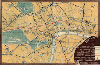
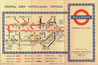
This timeline illustrates how the tube map has changed throughout the past 90 years. There is a clear development within the design doing the 1930's which is when Harry Beck first designed his own version of the map. 


1908


1921


1933


1937


1937


1938


1938 Version 2


1945


1948


1951


1951


1958


1960


1964


1968


1970


1972


1977


1985


1987


1994


1998


1999